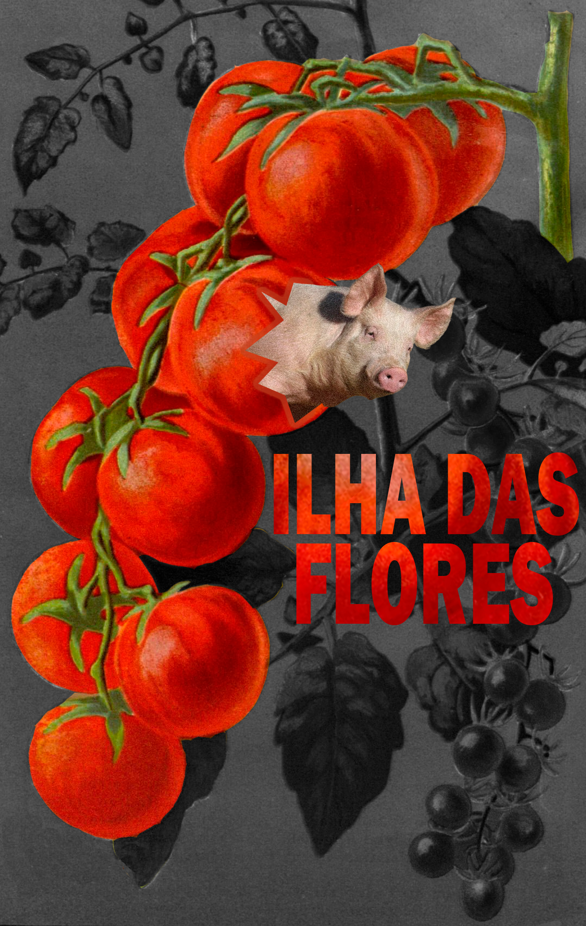
>>459511 (OP)What's with the photo of a pig? You have a ilustration of tomatoes, why smack a pig there and not an illustration of a pig?
That's one.
Also, since the ilustration has no hard shadows, the pig should also not have the hard shadows. Should be evenly lit.
Two.
You made hard, sharp, rough edges instead of a nice smooth edges. Like see the cut between (again) the pig and the tomato? Is just a line. Put some fethering/bluring/erase it a bit
Three
The silhuete in the background is pulling the focus away from the foreground
Four
The background is just boring IMO put some texture and put a nuce shadow/darkening around the edges coming from the tomatoes
Five
The text, all of it. Change it. The red is too harsh, the font choice is boring, the location is awful, it looks like is on top of the design, (because the bg pulls the focus) which it isn't and (again) the harsh vector lines hurt to see.
Maybe you should just pay an illustrator or painter to make it for you. I think you need a understanding or colors and composition to so it. Like, me saying what's wrong won't make you understand it.