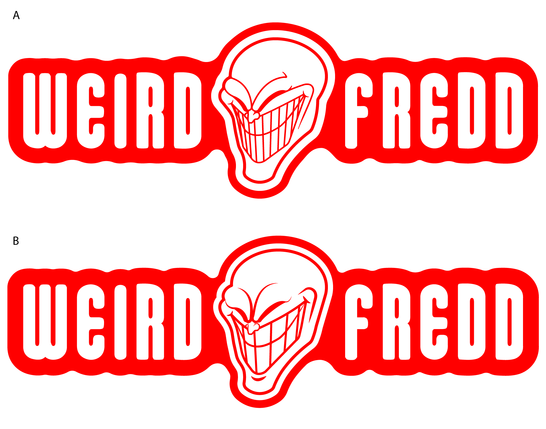
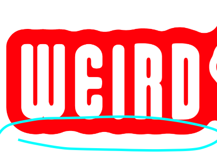
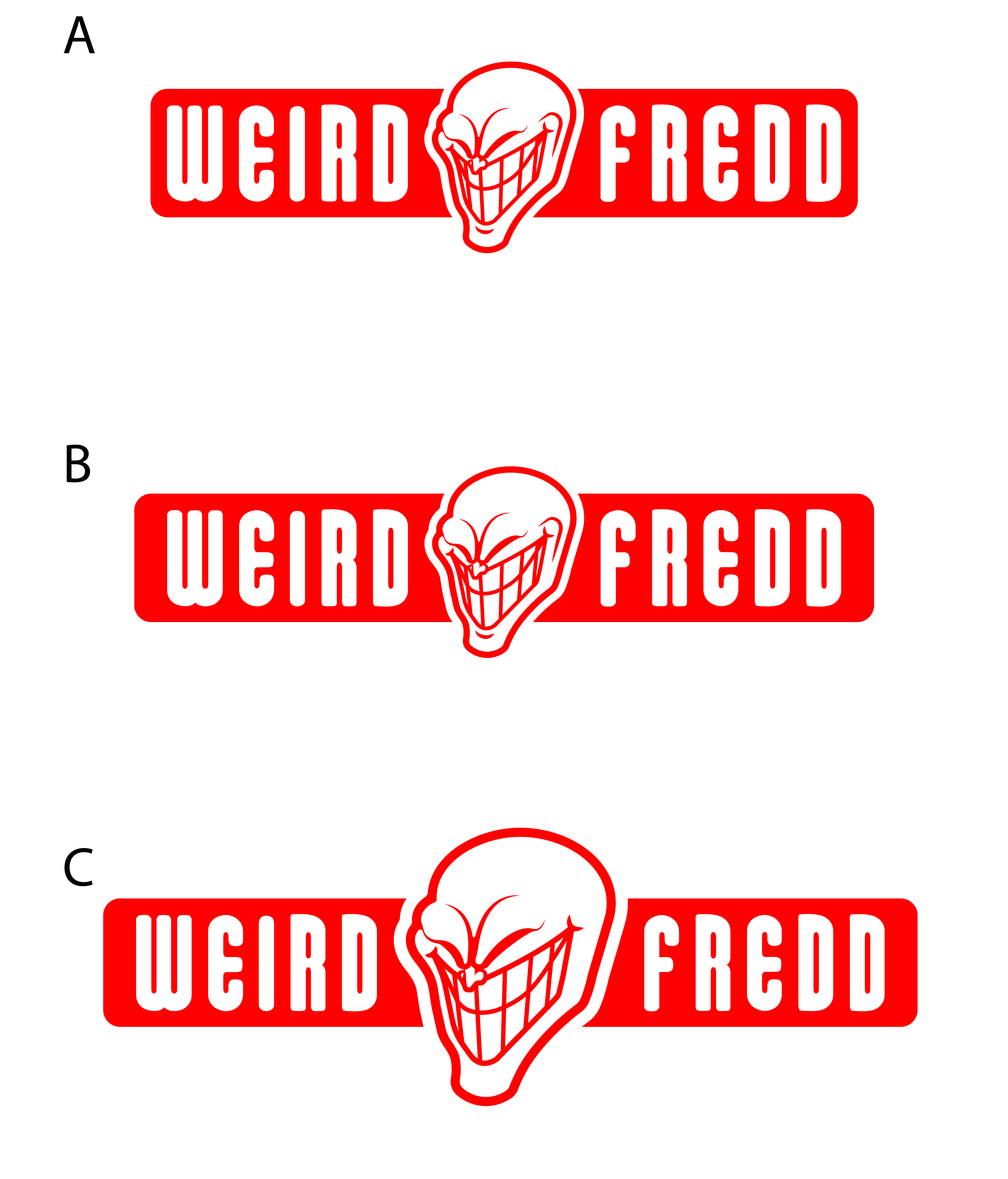
>>459650It's better but the circular end curves make no sense and just direct your eyes to the new width discrepancies they introduce between that background and the letter forms.
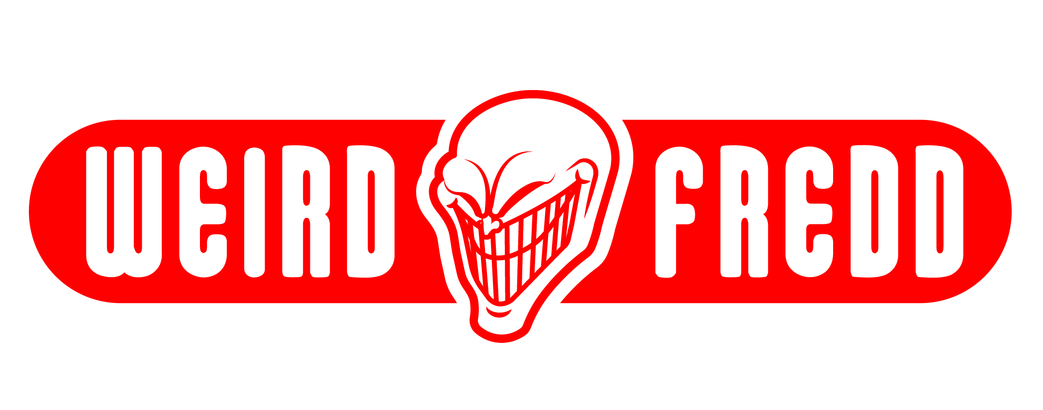
The beginning and ending letter shapes are actually very conducive to a simple rectangular background banner shape with rounded corners that loosely follow the letter shapes, only one corner deviates significantly from being symmetrical...why add a completely different curve?
One other issue screwing it up is that the letter spacing is way crowded; this not only affects legibility, it also makes the outside border look unbalanced because the border area between the letters is too small by comparison.