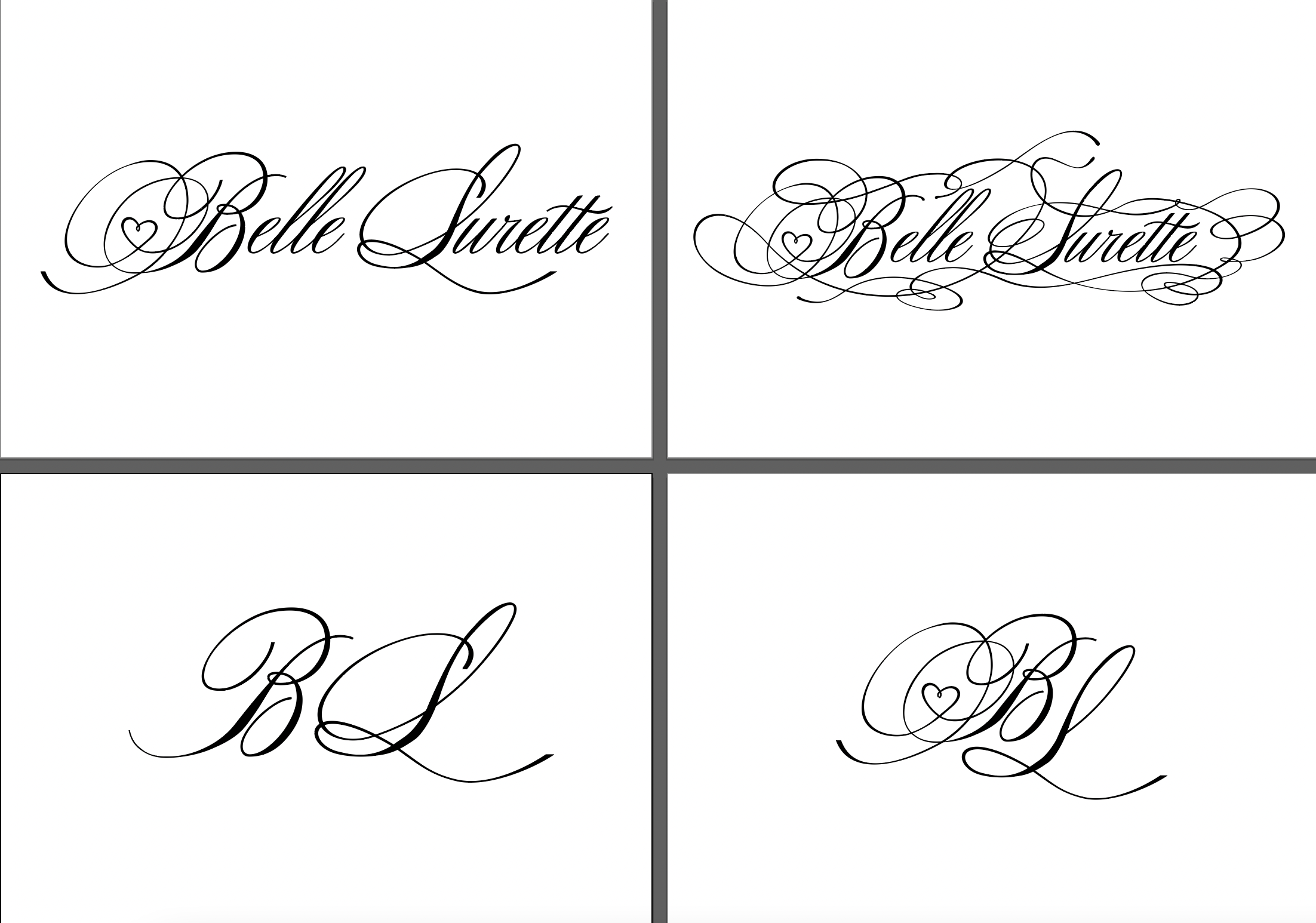
>>459733 (OP)>small clothing brand>industrial designerYou did your homework first of things like:
–Know where these letters will appear;
–What are the subtracts (paper, cotton, etc) where it will be printed;
– How they will be printed;
– What are the restrains of the printing method;
– What are the sizes that these letters will appear;
Right? Because I don't know if some of those lines would be printable in a clothing label.
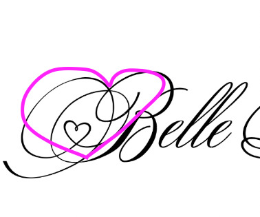
That being said, I like the idea of the hearth a lot. I think the "floating" feeling is because it is after some curves that it is formed, try making it appear on the first curve after the line leaves the B (please tell me if you did not understand what I said that i will try to rephrase it).
Some people will help better than me, so wait for them.
You could also try to make a implicit hearth being formed by the silhouette of the B + its lines, something like pic related (pic related is shit, but it is just to show the idea). I still think your idea is better, but I think it is worth to try it.