>>459748 (OP)Back
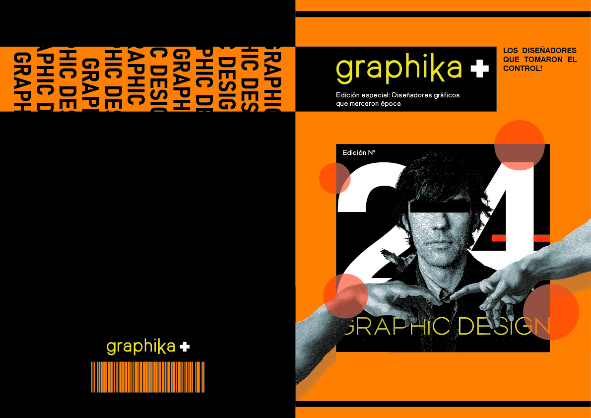
–This huge block of black should be rich black, not 100K. Add 20M and 20C. Or call your printer to know how they config "rich black" or "negro compuesto";
– This is not an EAN-13. You can have this barcode effect, but make it an EAN-13;
Front
–Yellow in Graphika has a bit of cyan that is making it both look like shit and will cause huge problems with printing (also applies to back);
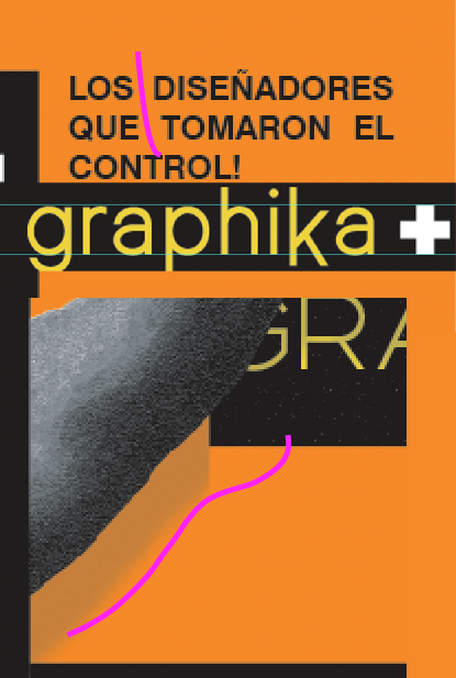
– The + is so fucking close to being justifies while not being justified it makes me really uncomfortable;
– The connected holes in LOS and QUE are a distraction. Here we call it "rat paths";
– "Edición especial" that has nothing special on it. I mean, just now I noticed it is a special edition and it is the 6th bullet point;
–The balls are shy and simply on top. Be bolder with them. Make them bigger. Make them go sometimes over, sometimes under, etc;
–The arms' shadows are not in overprint/darken/multiply;
– Always overprint black text over colored backgrounds (that applies for the Los diseñadores yadda yadda).
_________
Overall it is good, implying you are learning. But it lacks hierarchy, boldness and courage. Use this time to experiment a lot.