Thread 459892 - /gd/ [Archived: 121 hours ago]

Anonymous
3/13/2025, 7:08:07 AM No.459892
GOCbADnaMAA32Cc
GOCbADnaMAA32Cc
md5: fb366b1694b6869eda4217be103ff57b🔍
Might be a dumb question, but how do you go about designing something like this?
I assume it's through Illustrator but do you manipulate the texts in the way you want the font to be or do you get the font already made before hand? I've seen accounts give out "free fonts", so I'm a little confused.
Replies: >>459897 >>459921
Anonymous
3/13/2025, 4:54:42 PM No.459894
You can start with an existing font and convert it to vectors. People typically use the change one thing method to adjust one letter.
Replies: >>459944
Anonymous
3/13/2025, 10:58:05 PM No.459897
>>459892 (OP)
>Might be a dumb question
No brother, questioning is never dumb.

>how do you go about designing something like this
Well, it depends on what you are doing and what you want. Take a look at the Route X (top middle), if I had to guess, the "oute" is a preexisting font and the guy made the R and X in the style. As did Gateway, Onyx, Endless, etc.

Some look like custom made, like XION may have been made in a square grid and then skewed. The "Ghost" is clearly 100% custom made.

But more important than everything: take a look how with only type the designer was able to bring certain characteristics to the brand, how they were able to with only letters make you feel a certain way about it, etc. It is the result of plenty of research, knowledge and studies/versions of the logo/lettering/brand. When I work with custom type, (after research of references) I do prefer to work on paper, working mainly in the shapes, not lines, and then use the computer to match fonts or vector what need to be custom made. I am nowhere close to being that good and I am not a type designer, so maybe some other anon may be more qualified to talk to you about the process.

That being said, if you want to know how to do it and the thinking behind it, I would recommend you to take some courses on typography (how to think about type, learning the elements of typography, how to design it, etc) and to get the Ellen Lupton's book "Thinking with Type".
Anonymous
3/17/2025, 8:15:20 PM No.459921
>>459892 (OP)
Not a dumb question at all! Designing a collection of logos like the ones in your image is a creative and technical process, and I’ll break it down for you step-by-step. You're correct that Adobe Illustrator is a popular tool for this kind of work due to its vector-based capabilities, which are perfect for creating scalable, clean logos. Let’s dive into how you might approach designing something like this, including the font question.

Step 1: Concept and Research
Before jumping into Illustrator, you’d start by brainstorming the theme and purpose of the logos. In this case, the logos seem to be for racing tracks or events, so the design needs to convey speed, excitement, and energy. You might research existing racetrack logos, motorsport branding, or even sci-fi aesthetics (since some names like "Xion Arena" and "Odyssey Way" have a futuristic vibe). Understanding the tone and personality of each name (e.g., "Death Road" vs. "Cherry Peak") helps guide your design choices.

Step 2: Choosing or Creating Fonts
Now, about the fonts—this is where your question about "manipulating text" versus using "pre-made fonts" comes in. There are a few approaches:

Using Pre-Made Fonts: Many designers start with a base font that fits the vibe they’re going for. There are tons of free and paid fonts available online (like on sites such as DaFont, Google Fonts, or FontSquirrel) that you can download and use. For example, a bold, condensed sans-serif font might work for "Grand Pier High Speed Raceway" to give it a modern, sleek look, while a more jagged, distressed font could suit "Death Road." In your image, fonts like the one used for "Central Park Route" look like they could be pre-made, with their clean, geometric style.
Customizing Fonts: Even if you start with a pre-made font, you’ll often manipulate it in Illustrator to make it unique.
Anonymous
3/17/2025, 8:16:32 PM No.459922
This is called "type manipulation." For example:
You can convert the text to outlines (in Illustrator, select the text and go to Type > Create Outlines), which turns the text into editable vector shapes. Then you can stretch, skew, or distort the letters to fit the vibe—like the slanted, dynamic look of "Super Chase" in your image.
You might add effects like curves, angles, or flourishes. For "Phantom Tunnel," the lightning bolt in the "O" is likely a custom addition.
You can also adjust kerning (spacing between letters) or combine multiple fonts for one logo, like using a bold font for "Western Woods" and a lighter one for "Forest Road" beneath it.
Creating Fonts from Scratch: Some designers create entirely custom lettering for logos, especially for high-profile branding. This involves drawing each letter by hand in Illustrator using the Pen Tool or other shape tools. In your image, logos like "Electro Circuit Raceway" or "Night Sprint" have a very bespoke feel, with unique letter shapes that don’t look like standard fonts. This approach takes more time but ensures the logo is 100% original.
So, to answer your question directly: it’s often a mix. Designers might start with a pre-made font as a foundation, then heavily manipulate it to fit the design. Or, for a completely unique look, they might draw the letters from scratch. The "free fonts" you’ve seen online are great starting points, but they’re often customized further to avoid looking generic.
Replies: >>459923
Anonymous
3/17/2025, 8:17:32 PM No.459923
>>459922
Step 3: Adding Stylistic Elements
Once the text is set, you’d enhance the logos with additional design elements to reflect the theme:

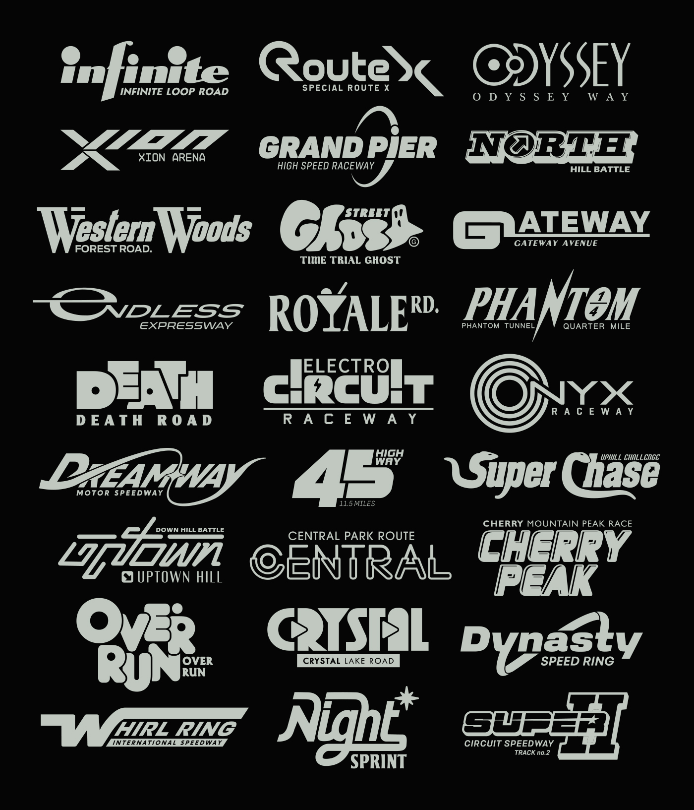
Shapes and Icons: Many of these logos include symbols like arrows ("North Hill Battle"), circles ("Nyx Raceway"), or even a ghost ("Street Ghost Time Trial"). These are often drawn in Illustrator using tools like the Pen Tool, Ellipse Tool, or Pathfinder to create custom shapes.
Effects: Adding effects like gradients, shadows, or outlines can give the logos depth. For example, "Over Run" has a slight 3D effect, which might be achieved using Illustrator’s 3D tools or by manually adding highlights and shadows.
Layout: Some logos have secondary text (like "Quarter Mile" in "Phantom Tunnel" or "Special Route X" in "Route X"). You’d experiment with hierarchy, placing the main name prominently and the secondary text in a smaller, complementary font or style.
Step 4: Color and Consistency
In your image, the logos are all in a monochromatic gray scheme, which gives them a cohesive look. This is likely a deliberate choice to make the collection feel unified, even though the styles vary. In Illustrator, you’d:

Set up a color palette (in this case, shades of gray).
Apply the colors to each logo, ensuring consistency in stroke weight and shading.
If these were for a real project, you might create alternate color versions (e.g., vibrant reds and blues for a more dynamic racing feel).
Replies: >>459924
Anonymous
3/17/2025, 8:19:29 PM No.459924
>>459923
Step 5: Tools and Techniques in Illustrator
Here’s a quick rundown of the Illustrator tools and features you’d use:

Type Tool: To input the text and choose your font.
Pen Tool: For drawing custom shapes or tweaking letterforms after converting text to outlines.
Pathfinder: To combine or subtract shapes (e.g., cutting out the star in "Crystal Lake Road").
Warp Effects: Under Effect > Warp, you can bend text into shapes like arches or waves (seen in "Dreamway Motor Speedway").
Stroke and Fill: Adjusting the stroke weight and fill color to create bold outlines or thin accents, like in "Whirl Ring International Speedway."
Replies: >>459925
Anonymous
3/17/2025, 8:20:30 PM No.459925
>>459924
Finally, you’d refine the designs. This might involve tweaking letter spacing, adjusting proportions, or testing how the logos look at different sizes (since logos need to be legible both large and small). If you’re working for a client, you’d get feedback and make revisions.

Addressing Your Confusion About Free Fonts
The "free fonts" you’ve seen are likely fonts that designers have created and shared for public use. You can download these and use them as a starting point, but as you’ve noticed in this image, most of these logos don’t look like they’re straight out of a font file—they’ve been customized. For example, "Route X" has a very specific angular style that’s probably been heavily edited, even if it started as a free font. The customization is what makes the logos unique and prevents them from looking like every other design using the same free font.
Replies: >>459926
Anonymous
3/17/2025, 8:21:42 PM No.459926
>>459925
Tips for Beginners
If you’re new to designing logos like this:

Start with free fonts to experiment, but don’t be afraid to modify them.
Look up Illustrator tutorials on YouTube for "logo design" or "type manipulation"—there are tons of great ones.
Practice with simple shapes and effects before tackling complex designs like "Electro Circuit Raceway."
Study real-world logos to understand what makes them effective (e.g., NASCAR or Formula 1 logos for a racing theme).
Anonymous
3/20/2025, 6:41:12 AM No.459944
>>459894
>convert it to vectors
When was the last time you saw an actual bitmap font, gramps?
Replies: >>459947 >>459948
Anonymous
3/20/2025, 12:43:35 PM No.459947
>>459944
So you can edit it with points obviously.
Anonymous
3/20/2025, 2:19:36 PM No.459948
>>459944
what "gramps" is probably talking about is that you need to convert the text element to a path object. (name for this of course varies with different programs)
>how to show that you don't know what you are talking about without saying you don't know what you are talking about
Replies: >>459954
Anonymous
3/21/2025, 3:15:50 AM No.459954
>>459948
So you know that TTF and OTF are vector fonts but still double down?
Replies: >>459956
Anonymous
3/21/2025, 4:20:21 AM No.459956
>>459954
no, but the way vector programs interface makes text elements behave differently to regular vector objects.

if a noob with no clue about this stuff asks, you have to tell them that you can transform characters into "forms" that can be intuitively and freely manipulated.

>duh