Fantasy Logo Help - /gd/ (#460055)

Anonymous
4/3/2025, 12:42:29 AM No.460055
nOdream Logo White
nOdream Logo White
md5: 8f4de4930db8e87211e69a344f6b003a🔍
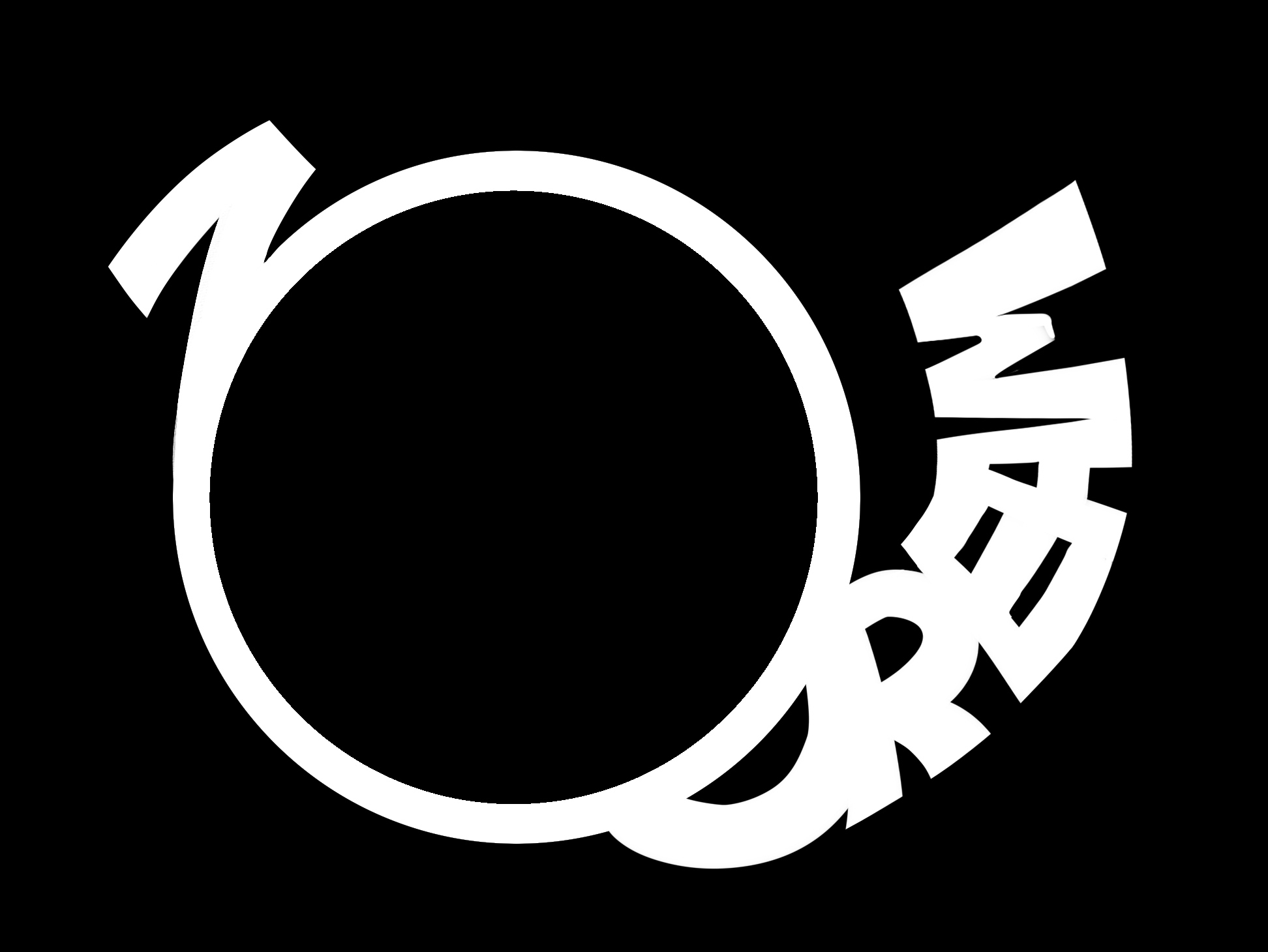
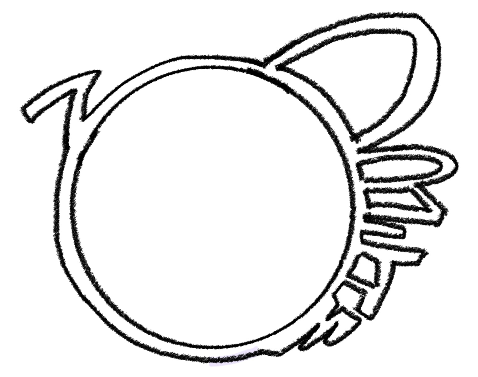
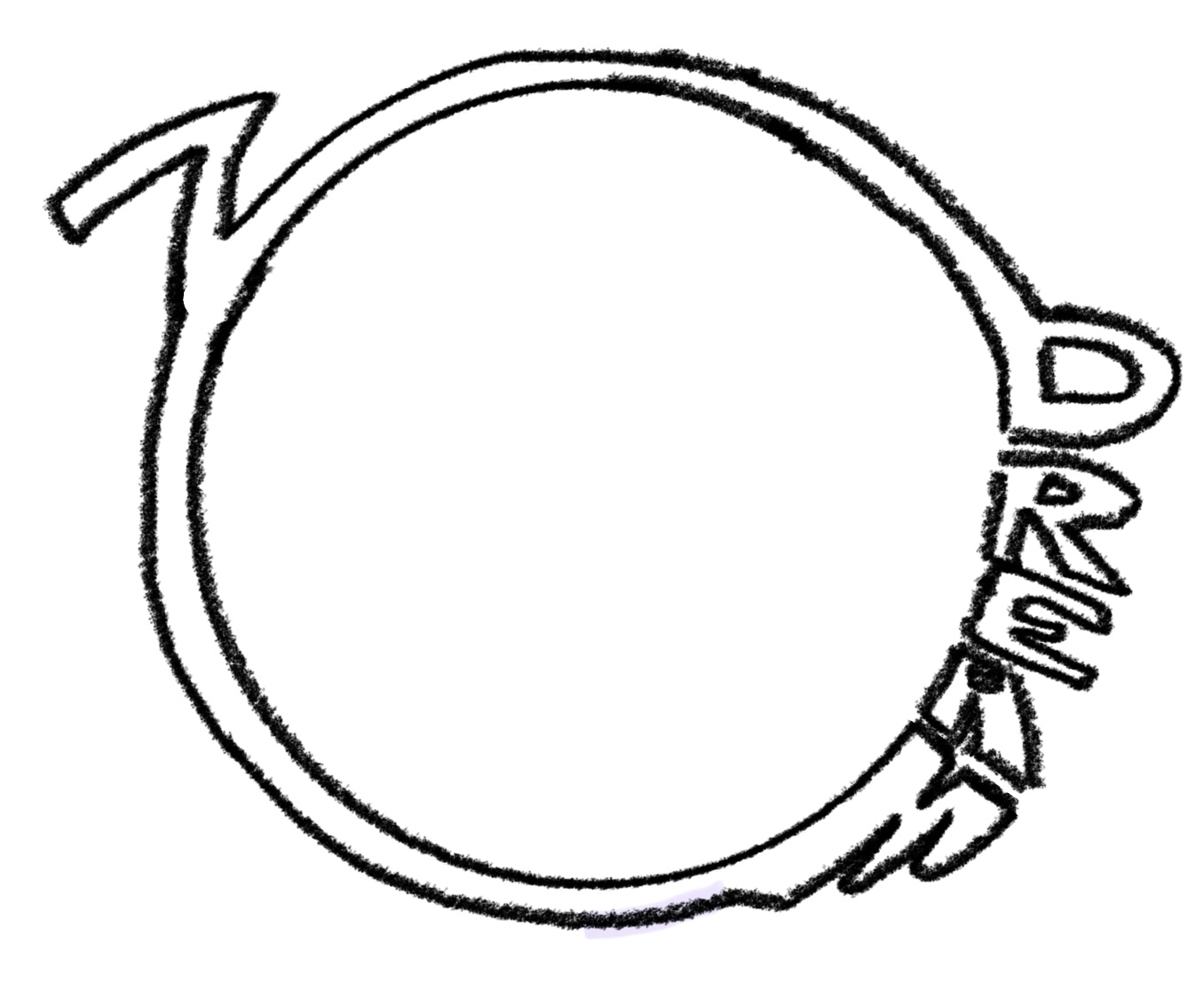
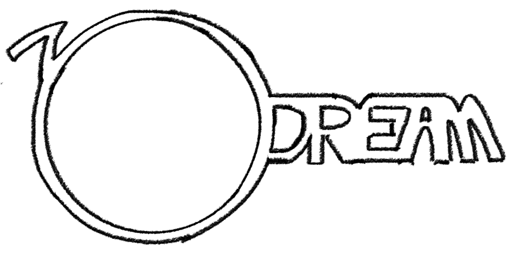
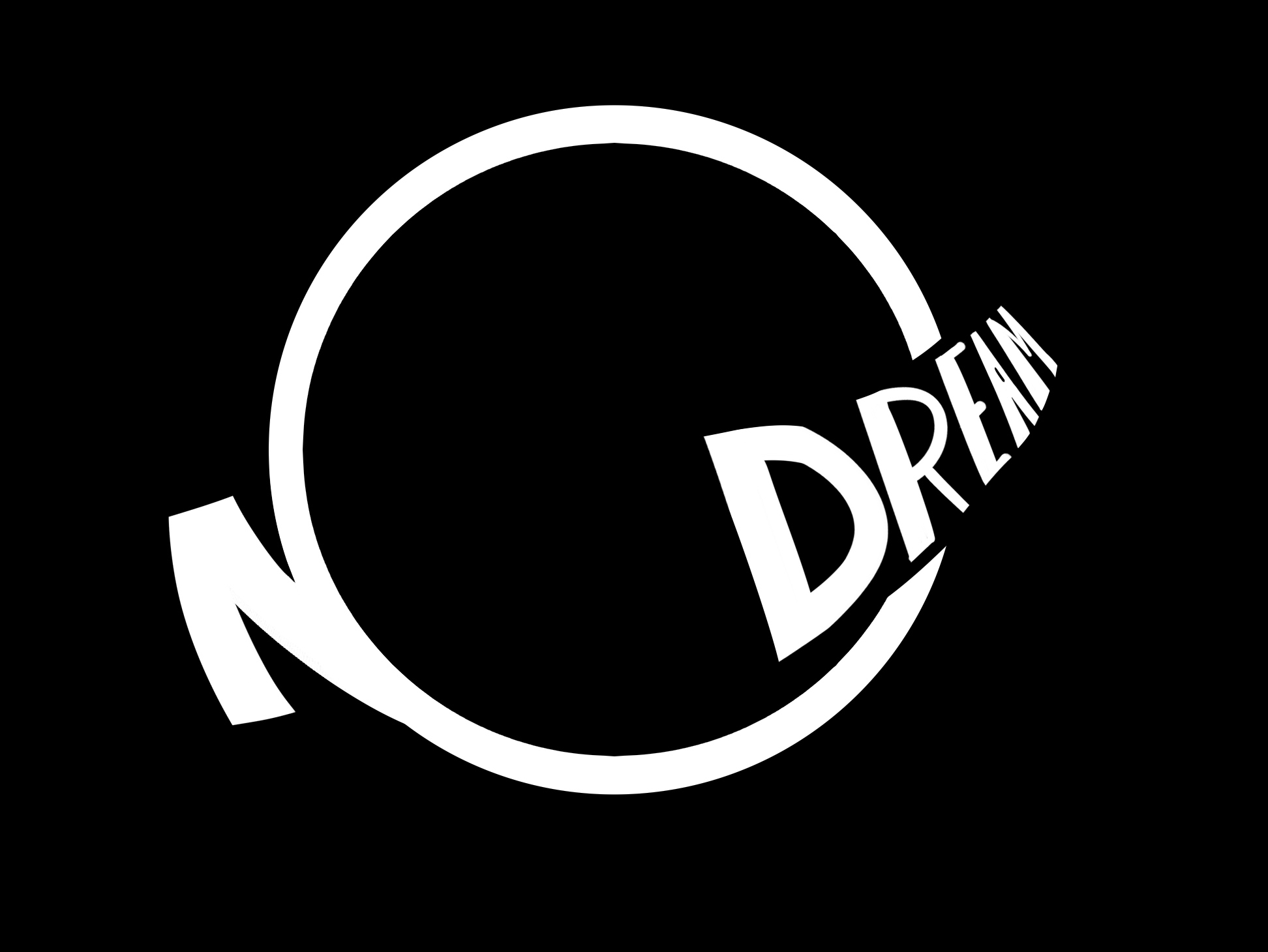
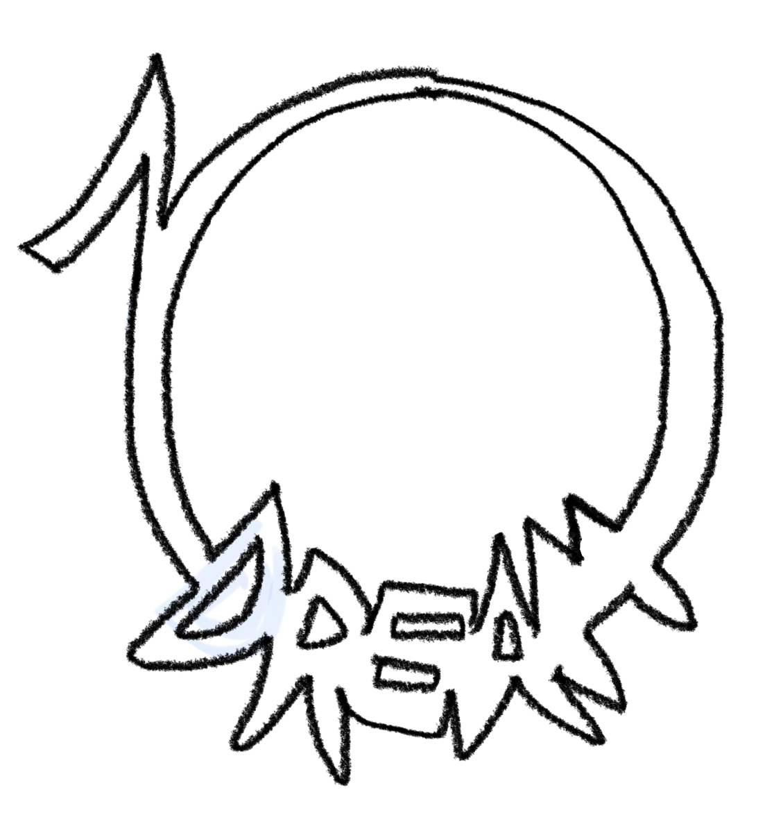
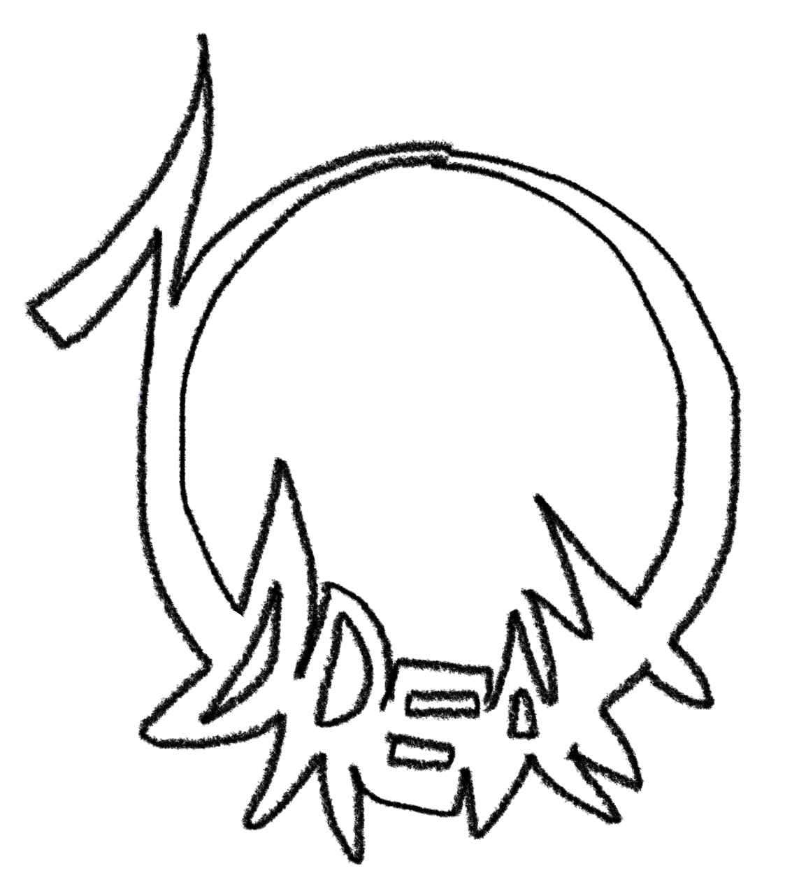
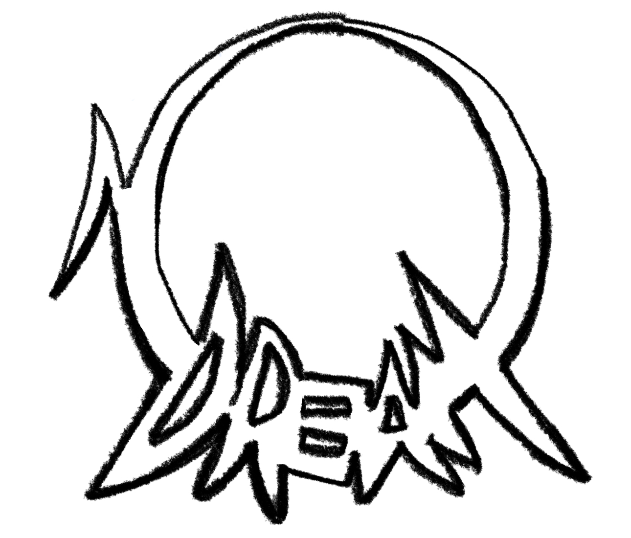
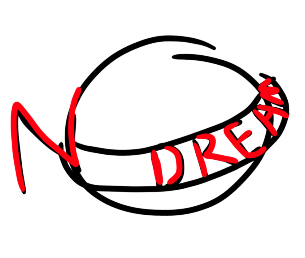
/gd/, I come in peace. I didn't see a general for logos in general so fuck it, here's my thread. After nothin on /ic/, I'm gonna post my sloppy attempt at a logo here for a fantasy concept of mine, stylized as "nOdream", as in the phrase "this is no dream". I thought it was mysterious and loaded with both positive and negative feelings, plus juxtaposing strong and conflicting words like "no" and "dream" together. Additionally, I believe it to be an anchor of sorts, a reminder for when even the most bizarre set pieces are explored or the most beautiful or terrible things happen.

The big "O" is representative of the world, while the warped lettering was meant to make it whimsical. I could play around with a few more styles for the typography for sure. The other reason for the letters being warped was to create a symbol of sorts that could be easily recognizable even to non-English speakers. Thoughts?

Originally, I was calling this "Key to the Kingdom", but after getting gummed up with lore and trying to make sense of what kingdoms go where and then having to reconcile set pieces I wanted with climates and so on, I got to a breaking point where I said fuck it and recommitted myself to focusing on individuals even as big things happen around them. I don't think I'll even give kingdoms names anymore, but write an indecipherable hash in place. With the importance of "kingdoms" reduced, I needed a new title, something more personal and unusual. This is what I landed on.
Replies: >>460056 >>460064 >>460646
Anonymous
4/3/2025, 12:53:33 AM No.460056
>>460055 (OP)
What software did you use?
Replies: >>460057
Anonymous
4/3/2025, 12:55:10 AM No.460057
>>460056
Paint Tool SAI version 2, so it's not vectorized. I made this in about fifteen minutes.
Replies: >>460058
Anonymous
4/3/2025, 2:48:40 AM No.460058
>>460057
you want criticism for a 15min logo?!
>ngmi
Replies: >>460059
Anonymous
4/3/2025, 3:03:34 AM No.460059
>>460058
So what?
Replies: >>460060
Anonymous
4/3/2025, 5:05:37 AM No.460060
>>460059
ngmi
>can you read?
Replies: >>460063
Anonymous
4/3/2025, 2:33:12 PM No.460063
>>460060
If you don't feel like giving critique then don't, I just don't know why you're wasting ten times the energy picking a fight when all you had to do was nothing. Had no idea /gd/ could be this fucking useless, lol, maybe the board should have stayed removed.
Replies: >>460067
Anonymous
4/3/2025, 4:59:16 PM No.460064
>>460055 (OP)
"No" part is awesome.
The "dream" part is bad. Can't read the D, E and A are together, hell, everything is together.

The idea is really good and the execution is on track, you just need to fix how the dream is reading. I would suggest you to draw the logo on paper and to try to fix it on paper, just so then you vectorize it or use a font, but pencil on paper will help you fixing how the "dream" reads faster than if you try to do it only on the computer.

Good work either way.
Replies: >>460066
Anonymous
4/4/2025, 1:56:25 AM No.460066
>>460064
So try and make the "dream" part more readable, got it. Thanks, glad someone saw what I was going for.
Anonymous
4/4/2025, 2:57:31 AM No.460067
>>460063
a total of 12 words in 2 messages
>ten times the energy

If you were a bit less hysterically pissed about negative reactions, then you would maybe be able to realize that even an uncomfortable response is a kind of criticism.

bro, you spend 15 min on it and now want other people to sort through your brainfart. what do you think how the actually successful people are doing it?
I can promise you that they dont stop after one iteration, asking for mommy to make actually something from the mess.

here, once more, in clear words for you:
fucking focus on the thing you are doing and continue thinking/working on it for 4 hours.

now show how butthurt you *really* are!

>it is not my main point, but you will agree that making anyone spend even half your time on working on *your* problem/project is somewhat of an insult.
Anonymous
4/4/2025, 2:13:42 PM No.460069
IMG_2355
IMG_2355
md5: ce7b65bd66418b02d47e0658daec8ecc🔍
Anonymous
4/4/2025, 2:14:43 PM No.460070
IMG_2356
IMG_2356
md5: 42b1263378164fdcf018c98b21fdfd64🔍
Anonymous
4/4/2025, 2:29:11 PM No.460071
IMG_2358
IMG_2358
md5: 88fde27eef9bb53672cb14c2ab6fd953🔍
Anonymous
4/4/2025, 3:07:56 PM No.460072
IMG_2359
IMG_2359
md5: a2cf4cd043f86dad759ef04a1e81447a🔍
Anonymous
4/5/2025, 9:10:26 PM No.460079
nOdream Logo White 02
md5: df75784dfbb02dc4933928384bdfbdb3🔍
If the others felt cold, this one feels "warm".
Replies: >>460083 >>460097 >>460176 >>460856
Anonymous
4/7/2025, 1:09:56 AM No.460083
>>460079
I like the rings around a planet approach. Maybe the N needs to be more pronounced in this case.
Anonymous
4/9/2025, 12:41:37 AM No.460097
>>460079
Loved this, but you need to fix the O having the bottom part bolder than the top part.

I also don't think the "dream" type is right. Maybe try to keep it a grotesque type. The effect is perfect.

Nice to see good work, brother.
Anonymous
4/27/2025, 12:21:27 AM No.460176
>>460079
The Dream text here is very cramped, and the readability for is important, especially from different sizes/differences. Could be fixed with more even width between the letters before using a perspective warp, and you can probably get away with stretching it further in, the bottoms of the letters more parallel to the bottom curve than the tops.
Anonymous
5/4/2025, 5:30:42 PM No.460229
is it just me or does this logo just scream goatse?
Anonymous
6/4/2025, 6:39:20 PM No.460459
IMG_3113
IMG_3113
md5: b74293ad3719be9c033c24a14967f252🔍
How about this one? I keep going back to wanting it to resemble a symbol.
Anonymous
6/4/2025, 6:46:57 PM No.460460
IMG_3114
IMG_3114
md5: 04b20677e9654791f909cd1fcd88d652🔍
A more aggressive version.
Anonymous
6/4/2025, 7:42:50 PM No.460461
IMG_3115
IMG_3115
md5: 8f7d59f4893ac796fd622e4a19de2e89🔍
Changed the N.
Replies: >>460463
Anonymous
6/5/2025, 12:59:48 AM No.460463
>>460461
I'm not a designer, but the N on the other pics looked like a Z at best.
This is more vertical but still I can't tell it's an N.
Try to make the width of the letter more consistent, even when it merges into the O. and maybe make the middle part the N a little bit longer? that could help with readability
Anonymous
6/24/2025, 3:58:13 AM No.460646
bam 'phil' margera
bam 'phil' margera
md5: a9fca93c09a11dfa4766cc53dd185453🔍
>>460055 (OP)
NorBam?
Anonymous
7/21/2025, 1:05:10 AM No.460856
1000030001
1000030001
md5: a17079f4bea1135664c5a3372233f641🔍
>>460079
make the " dream" bit like saturn's rings (starts at about the center of the circle, buldges away from it in the middle of the word and re"tightens" at the end, make it arc around the circle and shrink the circle a smidge. apologies for the poor example but im in bed and had to finger sketch it on my phone