Why does it feel off - /gd/ (#460462)

Anonymous
6/5/2025, 12:44:27 AM No.460462
hmmm
hmmm
md5: f0c74899c667cafa089aed33fc06a327🔍
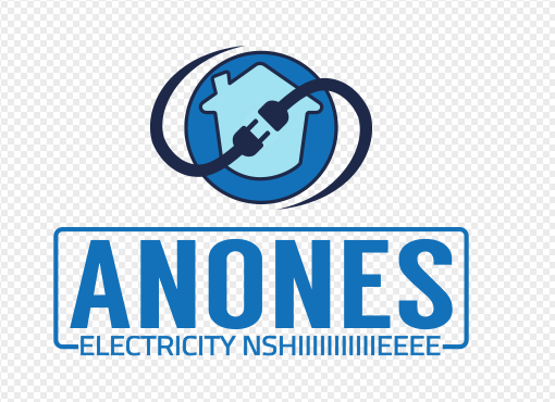
I'm trying to become an electrician and since every boomer in the job is a computer illiterate and their flyers look like absolute shit I figured I could benefit a lot from good branding.

So far I made this simple logo but I'm not totally convinced. I tried many thing with the color palette and this is the best that came out but still I'm not totally convinced, as if something is off or lacking in the design or too much disparity with the verbal part of my brand.
Can you enlighten me?
Replies: >>460466
Anonymous
6/5/2025, 6:17:00 PM No.460466
electrician-services-logo-logo-for-electrician-works-image-different-prefessions-concept-vector
>>460462 (OP)
Amusing that you come out of the gate shitting on "boomers" who are all allegedly computer illiterate and then manage to have the results of your concerted efforts to best them (using computer technology largely developed by boomers) look like you slapped together elements of the lamest, most generic low quality cheap ass 1980s royalty free clip art drawn by someone who had to settle for that shit job and is just phoning in the most trite "designs" imaginable.

I could explain in detail why that "brand" is laughably amateurish and creates more problems than it solves, but like 99.9% of these threads you'll just argue that I'm wrong and it's great and doesnt need changing, so have fun.
Replies: >>460468 >>460472 >>460506
Anonymous
6/5/2025, 7:57:36 PM No.460468
>>460466
>look like you slapped together elements of the lamest, most generic low quality cheap ass 1980s royalty free clip art drawn by someone who had to settle for that shit job and is just phoning in the most trite "designs" imaginable.
Yeah I read some pages of Inkscape's documentation and did that basic design from scratch using the same 3 basic tools.

>I could explain in detail why that "brand" is laughably amateurish and creates more problems than it solves

I'm listening
Anonymous
6/6/2025, 10:04:37 PM No.460472
>>460466
>I could explain this in detail but I won't... not because I'm incompetent but because... I just won't ok?
same bro same
Replies: >>460473 >>460474
Anonymous
6/7/2025, 3:41:57 AM No.460473
>>460472
lol do they owe you or what?
>entitled bitch ngl
>both of you ngl
>yes, me too ngl
Anonymous
6/7/2025, 6:10:02 AM No.460474
>>460472
try removing some or preferably all of these already covered details first and post the results

> your effort
>computer
>slapped together elements
>lame
>most generic
>low quality
>cheap ass
>1980s
>royalty free
>clip art
> the most trite "designs" imaginable.
Anonymous
6/8/2025, 7:55:37 PM No.460481
You're off to a good start. A suggestion I would make is to simplify you logo until it works in black and white. The apple computer logo is a good example of this.
Try starting with the black circle, delete the house and reverse the electrical plugs and delete everything outside the circle.

And set your text in Eurostile.
Remember, there is no other font than Eurostile.
Anonymous
6/12/2025, 5:22:15 AM No.460506
>>460466
Clip arts piss me off