>>462292
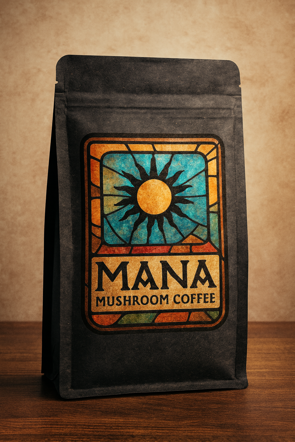
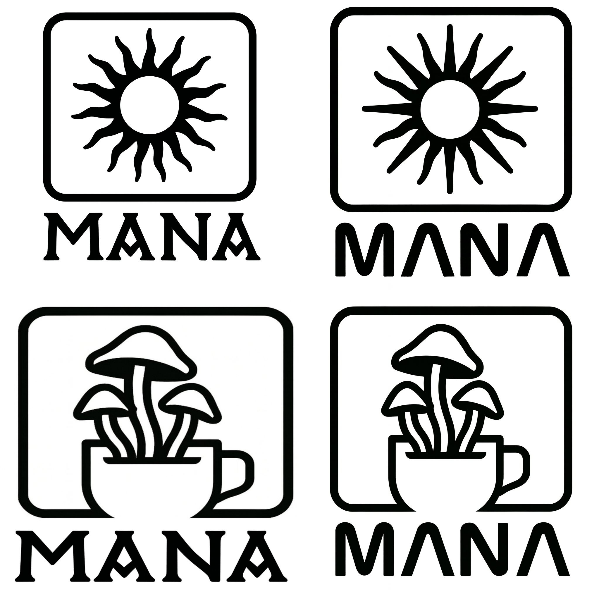
I personally don't like the mushroom's inside the mug, for drinks/coffee it reminds me of something rotten or abandoned.
But If you really like those elements, then you can try a lot of different things that will look way better, for example you can try making smoke coming from the coffee mug look like one mushroom and definitely make it solid color instead of the outlines you have, also 3 mushrooms is way too detailed.
There's an instagram i follow, is great for inspiration, is called "ai" but is just some of the best world designers sending their designs for the page to publish:
https://www.instagram.com/logos.ai
Then the next step would be to sketch the logo on paper in different styles, using references like logos or design images that you like, and from there picking up the best 2-3 ones and refine them, then start playing with colors, fonts and vectorizing them.