Search Results
7/7/2025, 9:25:21 PM
>>7635433
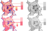
>made values worse than original in 3rd step
i already explained it here >>7635394. the point was even though the VALUES are less contrasted, it's fine because the contrast in COLOR is good enough. if you're critiquing my critique, i assume you already know about chroma and that kinda stuff. MOST IMPORTANTLY, the crit functionally ends at step 2, the 3rd step is NOT necessary!! OP's image already kinda did this, and i wanted to get close to the original values while still having contrast and shadows in the right places. however, i didn't bother to explain ANY of that in the first place so again, it's my bad.
again, though, the values in the final step aren't even that different from the original, intentionally so. i originally said "your values are kinda muddy" and i retract that statement because i myself was not looking at the color contrast.
>removed unique face rendering replacing it with bog standard generic blending
not sure what to say to this because any kind of critique would have made it worse lmao. there's no way for me to draw in another person's style better than they can, especially off of just one pic. crits always run the risk of being counter to the artist's original vision and there's not much you can do about it. it's less of a problem in real life compared to a slow message board though since you can adjust after feedback from the original artist
>>7635534
ultimately i agree. i never said the original looked bad, just wrong in a few places. it stands out and its flaws don't get in the way of its charm. taking shortcuts for the sake of style will always be the better choice.
...though it never hurts to be stylish AND correct...
Page 1