Search Results
6/2/2025, 4:39:33 AM
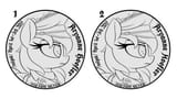
Different H in "Hoofler" to make it look more capitalized? 1 is the original, 2 is my modified version.
>>42239536
>These are small coins right?
They're just slightly over an inch and a half in diameter, so the readability shouldn't be much of an issue.
>>42239540
Soz moonbro, Luna just doesn't fit the theming as well as sunbutt-- especially a tyrannical sunbutt left as the sole ruler of Equestria during her sister's thousand year vacation.
>>42239542
Why would it be that?
>>42239557
I've been referring to the coins of the time, and both types of 's' are used. I don't personally like the look of ſ but if it's what anons want then obviously that's what we'll go with.
>>42239589
>'Celestisches Reich'
Ah, yeah, I see now why the anon that initially suggested that text said it that way. I think that makes the most sense of the options.
>Latin along the edge as the engraving
I like that idea. That would also address a concern someone had in a previous thread about the Latin not really fitting the coin's theme.
>significance of the flames?
Loosely sun-related flourish. I think it's a big contributor to how noisy this side of the coin looks, though. I asked about it in the previous thread, but now that there's more people to give feedback I'll make a side-by-side with or without it for people to vote on.
Page 1