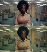
I imagine color grading and color direction being a prestigious job, something that some guys specialize in and something that directors ask for. You don't want your stuff to look dated, you want it to look like the latest hotness, so there are trends to follow or to go against but it's all very subtle so you need that expertise. Obviously everything is a job in film making (props, sets, makeup etc) but I think color grading is specifically something that can make or break a production in terms of convincing audiences that it's a serious work of art
I assume they decide on a very flat and neutral type of lighting in camera for several reasons. It's easier to set up, it's easier to bring the scene to different places with different color gradings depending on what the script calls for and they're also avoiding anything too dramatic which I think could be seen as "dated"
When color grading they seem to often settle for a very hazy look. Like there's a tinted gas floating around. It gives it a sleepy, subdued and "undecided" look, it makes the audience sense that something is trying to lull them into a false sense of security, so the paradox is that this "hazy" look actually makes people more alert, looking out for whatever is about to come through the mist
