>>7754369
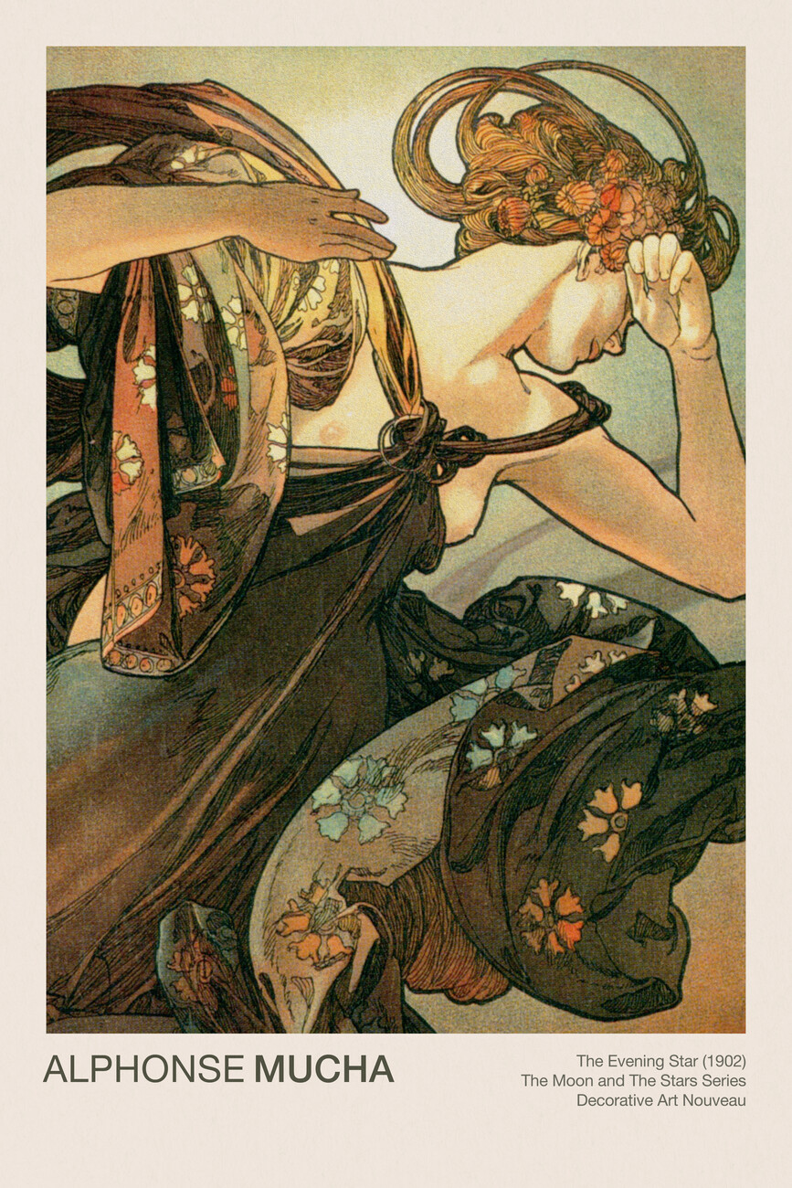
it has the exact same problem as the other one, lacks design. There is nothing wrong with using a graphic flat outline to help design, you're just not using it to it's fullest. Pic related also uses the graphic outline, however the black outline contrasts strongly with the pale/light chest and lighter background, leading the attention to it, enhancing the overall flow, where in other parts the outline contrasts less with the figure so it kind of fades away even though it's there all around the figure. The same with flow, even though this is graphic and flat, there still is flow present (even if for a large part due to the interesting pose, but nevertheless that is also part of design).
I have a feeling you're just copying the reference, nothing more. Very little thought on design, that's very likely the reason why the other anon is saying it looks generic.
4chan Search
1 results for "0aad275804b24b41f6fe8cd5b495b7fe"