>>42492070
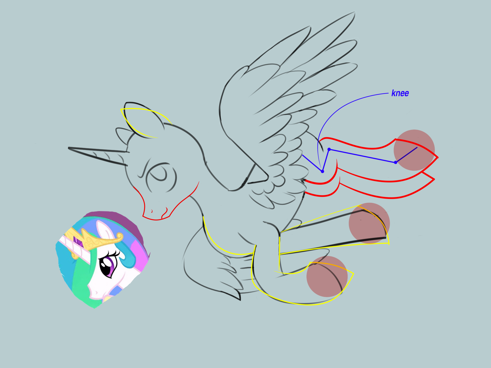
gonna preface with sorry for the book and if I come off as harsh and or way too autistic. most of the stuff is relatively minor mistakes. starting off with the snoot assuming you are drawing one of the princesses the snoot is too large and reads a bit more like a stallions, you need a gentle s curve on the bottom of the jaw so it doesn't read like a stallion to the viewer. the position of the eyes relative to the top of the snoot was good and properly placed for the large snoot so i took it and moved it down to match the new profile then added a little extra size to it to further refine it. the main problem with the wing is its position. it's basically coming out of the ponies neck and needs to be placed further back behind the shoulder. the yellow lines are suggestions more or less you could entirely leave them as is if you choose it just looks a little better, the hoof position for the fore leg with it pointing straight down is good for an animated trot cycle but looks a little awkward in a still image in my opinion. the legs are a bit noodley in the back and for where the knee is positioned makes them look a bit awkward so my suggestion would to be either to follow the red line or rotate the knee back and reshape the butt line to match the leg position. usually if say you look at a show screen shot of a Pegasus the butt line makes a gentle s curve when connected with the front of the leg and they also tend to tuck their legs in slightly when flying, uguu related https://d.uguu.se/RekkPlxN.png.
4chan Search
1 results for "1300c8d7d82c3473b9e5ca1681fbb913"