>>457619
It's just for readability.
Old airbnb looked like
>ainlnl
Old pinterest looked like
>AintereA
Old ebay and spotify looked they were having a seizure.
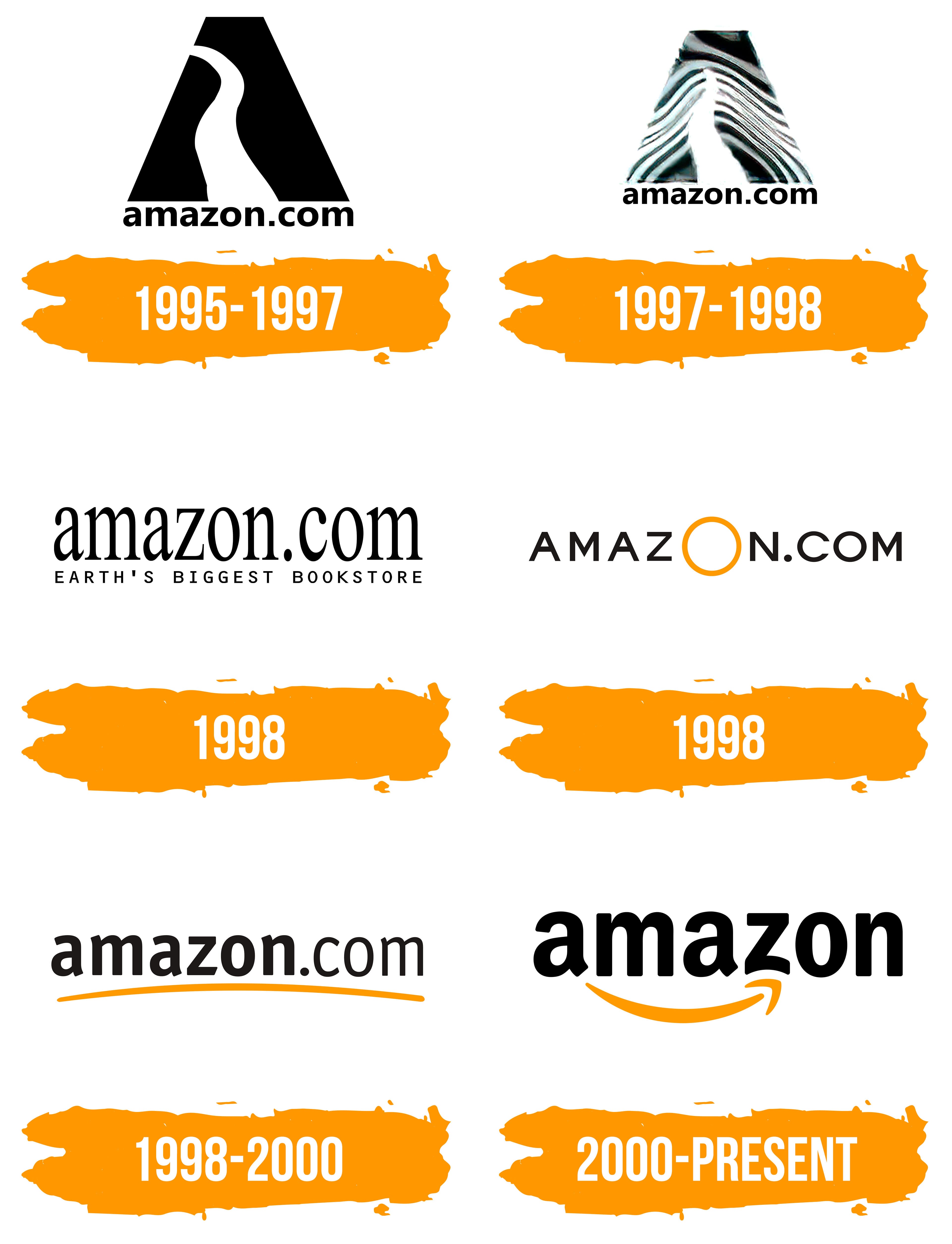
Amazon still has plenty of character in their logo. Instead of just simplifying font, it's actually become recognizable by the arrow alone.
4chan Search
1 results for "472dcbb298ded80bf603e21c9f8a979c"