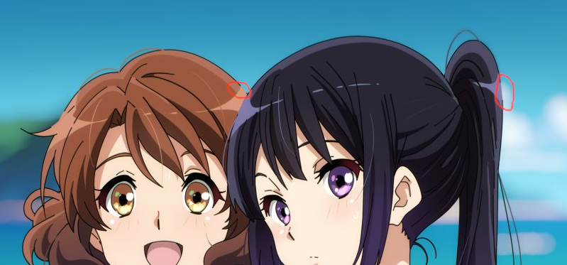
I hate this style.
You either have thick outlines to make the characters pop out or you have soft outlines to make them blend in.
It makes no sense to have a black outline that gets lightened when adjacent to highlighted surfaces. The outline isn't part of a surface, it's a cartoonish element, not a realistic one.
It just looks so out of place.