I'm curious where people are getting their references for Kodachrome. Something like >>4450067 doesn't come close to me at all.
>>4454561 Seems too green-blue, but contrast isn't bad, and the others are way too heavy-handed on lifting the blacks
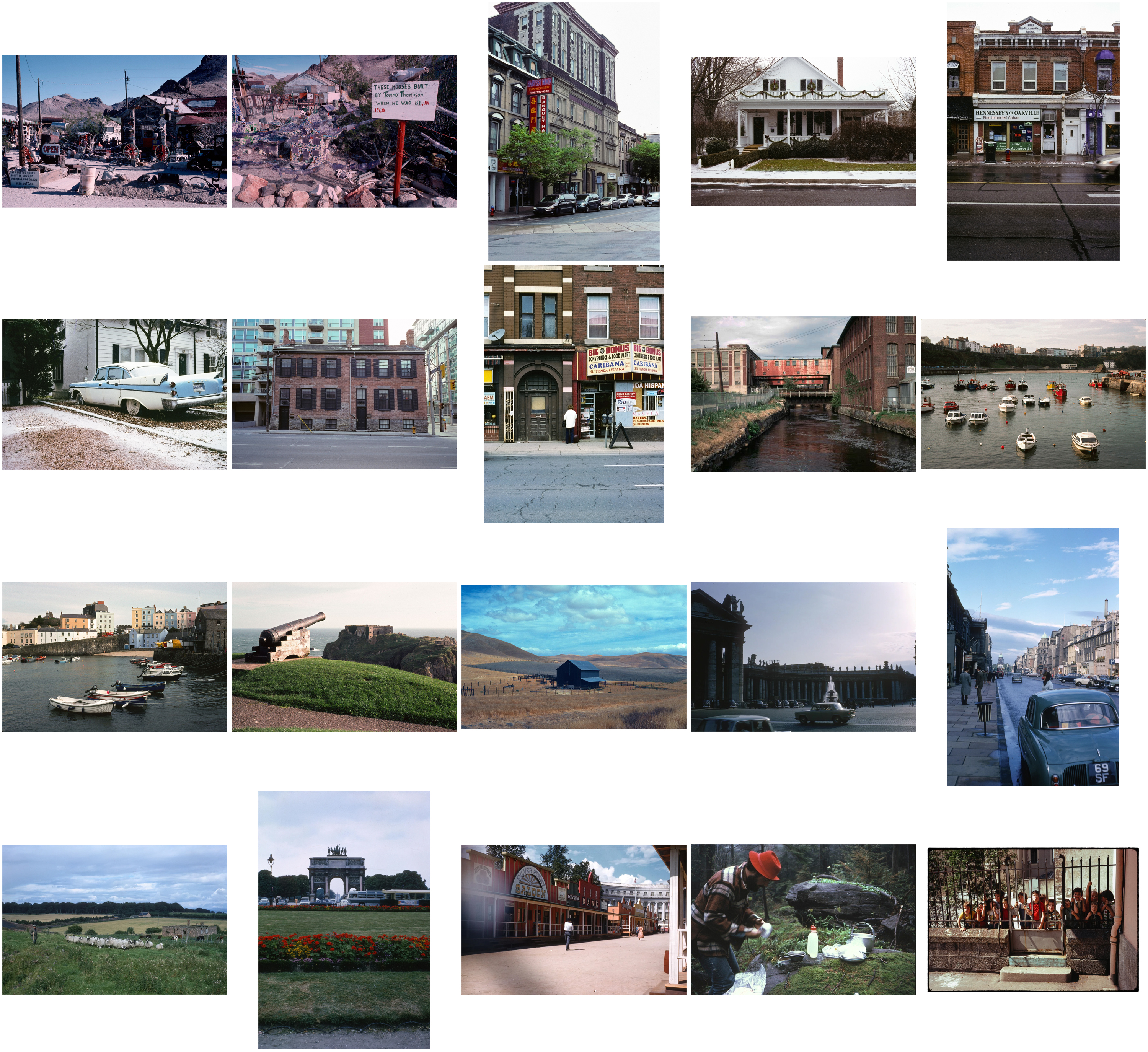
Picrel are some example k25 + k64 scans from a few different sources. Obvious differences in color cast, but you can still see some commonality.These samples are much more in-line with the kind of hues and contrast I'd expect from the kodachrome slides I've seen irl.