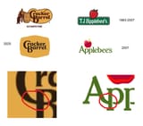
it's been at least twenty years since companies have been doing this dumbed-down flat/minimal gimmick... it is hardly a "modern" design, it feels dated, particularly reeks of 2007-era brand identity crisis desperation, as brands struggled to figure out how to navigate the then-nascent era of "smartphones" and "the web"
in fact, cracker barrel simply needed to do nothing, as brands in general are reverting to their old logos under the guise of "newstalgia" (e.g. burger king)
