Anonymous
6/8/2025, 8:03:40 PM No.1529300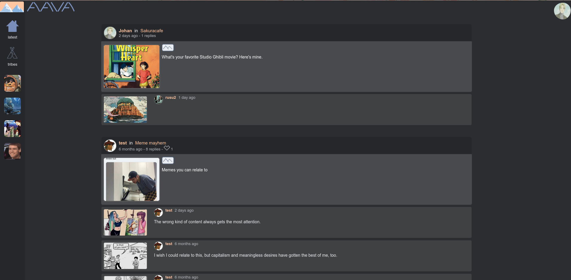
I'm coding a socmed platform from scratch (like before).
Again, I need your opinion.
What should I change?
I think it just looks a bit messy with the icons on the left.
My site is like a combination of Discord + 4chan. You join "servers" (represented by the icons on the left) and on the servers you post threads. So they're not chatrooms but more like sub boards on an imageboard.
Also I think the name Aava needs to go, I'm thinking "Dango".