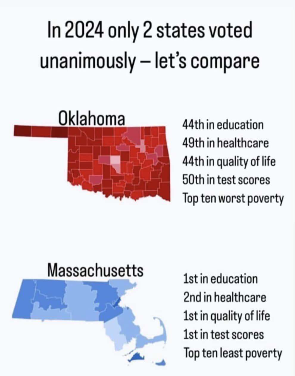
>>938199277
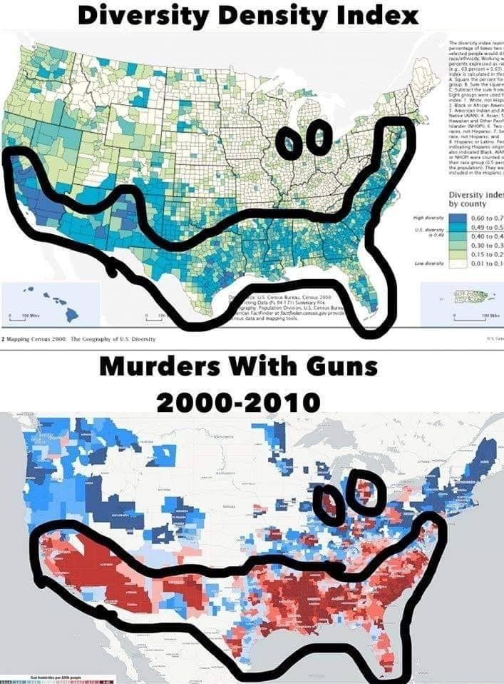
I'm not going to mathematically calculate how little those maps correlate, it's pretty obvious visually that they don't. The extra
-bold outlining normally makes that more difficult, but just look at Michigan, completely different outlines.
The shapes within the bottom outline are drastically different, and the regularity of shading in many places are actually reversed.
Like Texas, diversity has an apparent negative correlation with gun violence, so those counties most diverse appear to have the least gun violence, probably why northern Texas isn't circled. The way Arizona is circled is obviously dishonest, because on the diversity map, it circles the land underneath Navajo county, despite the high diversity index, and it completely covers the Yavapai and Mojave, which have lower diversity than the rest of the state, but on the gun violence map, they're circled, and dark.
Diversity index in California is dark nearly to Oregon, but on the gun Violence map, it's circled only about half way up the state.
I think Louisiana is the most funny example of how little these maps actually relate to each other, Louisiana is speckled on the diversity map, yet dark as can be on the violence map, and with an apparent negative correlation (Less diverse heel of Louisiana is more violent.)
These county-wide differences between 2 county-wide measurements could only be explained by a lack of correlation.