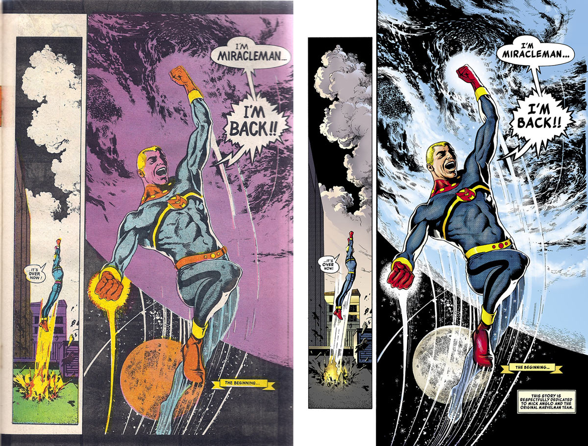
← Home ← Back to /co/

Thread 150064601

73 posts 32 images /co/
Anonymous No.150064601 >>150064673 >>150065360 >>150065393 >>150066070 >>150067355 >>150068604 >>150068630 >>150069637 >>150071173 >>150073237 >>150074428 >>150075732 >>150078668 >>150078683 >>150079939 >>150080417 >>150080742 >>150085853 >>150085910 >>150088172 >>150091427 >>150093438
I really like this aesthetic - the yellowed paper, the texture, the slightly imperfect panel lines, the dimmer colors, it feels more "real" that digital comics
Anonymous No.150064673 >>150076532
>>150064601 (OP)
based
Anonymous No.150065360
>>150064601 (OP)
Digital comics age incredibly poorly in a way that I feel like nobody really talks about, unless it has really good shading (borderline never) then it basically has no shelf life
Anonymous No.150065393 >>150069674
>>150064601 (OP)
One thing I miss about the Silver Age is that Superman just did dumb shit all the time with a straight face
Anonymous No.150066070 >>150068138
>>150064601 (OP)
I love the hand-drawn look. Fuck digital.
Anonymous No.150066161 >>150068212
Cheap inking has its appeal, yeah.
Anonymous No.150067284
It's amazing that the people most likely to rape and butcher these old comics are boomers who get easily impressed by digital coloring
Anonymous No.150067355
>>150064601 (OP)
I hate when they reprint old comics in shiny white paper
Anonymous No.150068138
>>150066070
You still have to draw digital art by hand
Anonymous No.150068212
>>150066161
I wouldn't call this cheap inking. Modern art may have more polish but the inking is usually really rough and sketchy these days
Anonymous No.150068604 >>150069605
>>150064601 (OP)
I'm sure there's a "remastered" scan of this somewhere
Anonymous No.150068630
>>150064601 (OP)
I miss when comic looked like comics.
Anonymous No.150069605 >>150069653 >>150069659 >>150071173 >>150079939 >>150085910 >>150088172 >>150090239
>>150068604
Anonymous No.150069637
>>150064601 (OP)
You're right
but sometimes the lettering is blurry because of the crummy printing
or maybe I just need glasses
Anonymous No.150069653
>>150069605
Not the worst I've seen but still pretty garish
Anonymous No.150069659
>>150069605
not the worst tbf
They didn't try to reinvent the colors or digitally shade them
Anonymous No.150069674
>>150065393
I miss this too.
Superman should just be doing crazy shit but writers need to keep the JOKES OUT
Anonymous No.150071173 >>150074930
>>150064601 (OP)
>>150069605
That sort of "texture" really works it's magic to help add a lot more variance to areas that aren't shaded, it helps make tones like the skin feel moderately more realistic in a way that just isn't present when it's cleaned up.
Anonymous No.150072223
Okay.
Anonymous No.150073237 >>150073261 >>150074510
>>150064601 (OP)
Comics should be black and white.
Anonymous No.150073261 >>150079835
>>150073237
Soeme should. Superhero comics aren't built for it though, at least not traditionally. the characters rely on color for their designs, especially differentiating them.
Anonymous No.150074428
>>150064601 (OP)
same
Anonymous No.150074510
>>150073237
Comics actually need to RETVRN to 4-color
Anonymous No.150074930
>>150071173
I couldn't articulate it but absolutely, they knew what they were working with and how to use the old shitty paper to their advantage
Anonymous No.150075732
>>150064601 (OP)
Agreed, I've been combing dollar bins for vintage comics the last couple years because they do look better in their original presentation than in modern reprints. Ben-Day dots and CMYK colors create some subtle effects rather than just the flat, auto-fill colors of modern reprints.
Anonymous No.150076532
>>150064673
based on what
Anonymous No.150078668
>>150064601 (OP)
... like a SPONGE!
Anonymous No.150078683
>>150064601 (OP)
>... like a SPONGE!
Anonymous No.150079835
>>150073261
They can be. Just make the designs stand out in black and white.
Anonymous No.150079939
>>150064601 (OP)
SOVL
>>150069605
Soulless
Anonymous No.150080157 >>150081579
pre-digital comics were colored and inked with the medium of newsprint in consideration, much like 8-32-bit video games were made with CRT screens in mind
Anonymous No.150080395 >>150080712 >>150081002 >>150081207 >>150081584 >>150084349 >>150085888 >>150088831
>bunch of 16 year older zoomies pretend that comics looked like this out of choice or that it better because it was more ~retro~
Anonymous No.150080417
>>150064601 (OP)
Anonymous No.150080712
>>150080395
based collectivist neoreligionchad
Anonymous No.150080742
>>150064601 (OP)
So you enjoy ugly and stupid. Was that why you fucked your mom?
Anonymous No.150081002 >>150083405 >>150088627
>>150080395
NTA, Greek and Roman statues used to be painted with many bright colors which faded away over time, later periods would eventually come to admire the white marble look even though that's not what it was meant to look like. Same principle applies here.
Anonymous No.150081207
>>150080395
t. screen-addicted consoomer millennial
Anonymous No.150081579 >>150081584 >>150084349
>>150080157
Modern digital coloring looks cheap and off-putting most of the time.
Anonymous No.150081584
>>150081579
Meant for >>150080395
Anonymous No.150083405 >>150085927
>>150081002
Marble looks good.
Anonymous No.150084349 >>150085356
>>150080395
>>150081579
Look at this shit and tell me it looks good in the digital recolor.
Anonymous No.150085356 >>150085446 >>150085615 >>150085815 >>150086060 >>150097147
>>150084349
Post more comparisons, this is interesting
Anonymous No.150085446
>>150085356
Anonymous No.150085615 >>150085650
>>150085356
Anonymous No.150085650 >>150085799
>>150085615
Middle definitely seems like the best here, it's not as washed out as the left but not as garishly bright as the right, in fact the right reminds me of when remasters of cel animated cartoons and anime try to remove film grain but it makes it look much worse
Anonymous No.150085799
>>150085650
The middle was the original poster attempting to do a modern recolor that isn't as over-saturated and digital-looking as the one on the far right.
Anonymous No.150085815
>>150085356
Anonymous No.150085853 >>150090134
>>150064601 (OP)
Oxidation isn't an aesthetic choice, it wasn't intentionally done, the pages were white and have weathered over time
Anonymous No.150085888
>>150080395
It varies. It's like a yellowed and dirty top coat of a painting being confused as an intentional patina.
Anonymous No.150085910
>>150064601 (OP)
>>150069605
what do you think /cock/
Anonymous No.150085927
>>150083405
>Marble looks good.
Sure does, but it looks like that out of choice and an aesthetic association not because that's what a period accurate statue looked like. Much like some people may appreciate aged paper and slightly faded colors on a comic page.
Anonymous No.150086060 >>150086098 >>150087239 >>150094950
>>150085356
Anonymous No.150086098 >>150086806
>>150086060
weren't his powers based of nuclear radiation or sum? why is his hand glowy effects white instead of orange and yellow?
Anonymous No.150086806 >>150086864
>>150086098
Just more proof of how modern recolors suck
Anonymous No.150086864
>>150086806
they really suck
Anonymous No.150087239 >>150090536
>>150086060
What gets me about the recolors is how oddly boring they are, they're trying to hard to stay "on-model" more than being creative
Anonymous No.150088172 >>150088197 >>150097147
>>150064601 (OP)
>>150069605
So is there any in-depth explanation as to how they did old color palettes for printing compared to new colors for digital remakes?
Anonymous No.150088197 >>150088280
>>150088172
Well here's one who worked on digital recolors for Marvel https://www.reddit.com/r/comicbooks/comments/13iqgpi/comment/jkbjuox/
Anonymous No.150088280
>>150088197
Thanks lad, color direction hits me really good in the autism
Anonymous No.150088627
>>150081002
The reason for that was some autistic archaeologist in 19th thought they should just plain. This was accepted dogma until better evidence proved that were traces of paint flakes. It wasn't just statues but also buildings too. I would think the Pantheon would looked a lot colorful back in the day.

I just find it odd that painted statues were just forgotten for over a 1000 years.
Anonymous No.150088831
>>150080395
>comics looked like this out of choice
The coloring and art was done to get the most out of the page quality they had at the time
So in a wayyeah
Anonymous No.150090134
>>150085853
Just because it wasn't intentional doesn't mean it wasn't better
Anonymous No.150090239
>>150069605
man ugly as sin
Anonymous No.150090536
>>150087239
It's not so much the on-model that I have an issue with as the "realism"
Anonymous No.150091427 >>150094285
>>150064601 (OP)
the comic industry was really hurt by the move away from newsprint
as soon as they started using expensive paper and inks, comics shot up in price, so people bought less comics and stands disappeared from grocery stores and gas stations. when comics were little more than a buck, it was easy to justify the purchase, now they are expensive enough to make you have to decide if you really want one. on top of that they used to be everywhere, so it was easy to catch your eye, now you have to go out of your way to find them
the "improved" visuals inadvertently destroyed the market
Anonymous No.150093438 >>150094304
>>150064601 (OP)
When can we get this?
Anonymous No.150094285
>>150091427
The 80's move to Baxter Paper for certain Direct Market books kept prices around a $1.00 and the printing quality improved, it was a good middle-ground for comic printing. The problem was switching over to glossy and semi-glossy magazine-style interiors.
Anonymous No.150094304 >>150096761
>>150093438
>When can we get this?
?
Not sure what you mean
Anonymous No.150094950
>>150086060
Black and white is best.
Anonymous No.150096761 >>150097303
>>150094304
Where to buy?
Anonymous No.150097147 >>150097974
>>150085356
https://www.pipelinecomics.com/mcspidey/amazing-spider-man-309-styx-and-stone/
Scroll down half way past the story summary where he talks about the digital transfer for the Mcfarlane omnibus.
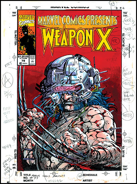
>>150088172
Marvel colorist/writer Gregory Wright commented a few times on Cartoonist Kayfabe. I was just about to leave a comment asking them to please start interviewing the colorists when Ed's drama exploded. CK barely scratched the surface of coloring. I would have loved a comprehensive explanation of the changes of paper and methods through the decades with some of my favorite colorists like Greg, Steve Buccellato, Glynis Oliver, Steve Oliff, BWS and a host of others. Man, fucking Ed...

"BWS designed the color for Weapon X specifically to be printed on the cheap newsprint typically used for comics. When Marvel collected the story in it's subsequent hardcover and paperback trade collections, they failed to adjust the color levels to compensate for the better quality paper the trades are printed on. The result is that the color in the trade collections of Weapon X is lurid and oversaturated, and does not represent what was intended by the artist. Despite the weaker blacks in the original Marvel Comics Presents printings (due to the use of plastic printing plates Marvel was experimenting with at the time to save money), those editions on newsprint are a truer representation of the work. BWS has contacted Marvel to try to get them to adjust the color on successive reprintings of the Weapon X trade collections, with no response."
From here:
https://www.barrywindsor-smith.com/studio/bwsbio23.html
Anonymous No.150097303
>>150096761
Buy what? Vintage comic books? Any local comic shop that carries back-issue boxes.
Anonymous No.150097974
>>150097147
That's the reason why I didn't buy the McFarlane omnibus; the linework looked faded