disks-2
md5: e8c6a78f56b858438575cef49c94c401
🔍
i don't like the new icons
>>106160127 (OP)What is with weird perspective?
Feels like the silhouettes are less defined. If that is even the right word.
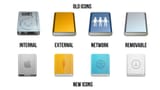
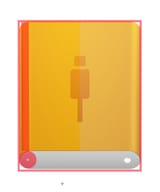
>>106160127 (OP)why does the internal one looks like it has a usb-c connector
>>106160261and why does the removable disk icon look like the ~/Downloads folder?
>>106160127 (OP)Has to be woman with no spatial awareness, like brain should not allow you to even draw something illogical like that.
>>106160127 (OP)entropy is rapidly sinking both apple and microsoft. could this year finally be the year of the linux desktop? haha j/k
really putting those retina screens to good use
>>106160127 (OP)They probably had requirements that they couldn't distort the Apple logo, that it had to include the logo, and that it had to show the front.
now they're all soap bars, thank you tim apple
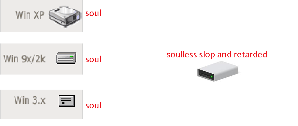
Most blatant case of
>SOUL
>SOULLESS
>>106160127 (OP)actually looks like adwaita lol
>>106160127 (OP)Not an apple fag, but the old network one looks gay as hell, new one is better for that one
>>106160169Webshits and UX foids only know how to draw rectangles and ever so slightly rounded rectangles.
>>106161238>rectanglesemphasis on rectangle and not quadrilateral
>>106160127 (OP)you vill like liquid ass and you vill be happy
ijeet
md5: f12442f0d7d05b534d1cb7943ccf3446
🔍
>>106161238>>106160169SAAR THIS IS 3D PRESPECTIVE SAR YO SEXIS AND HINDUPHOBIC THIS IS VERY GOOD DESIGN YES
>>106160169It can't decide if it wants to be isometric or orthographic view.
>>106161021How the tables have turned
>>106160127 (OP)Saar why did you click icon?
>>106160127 (OP)man i quite prefer the old ones. the network iconography is better but thats about it
>>106160127 (OP)The old Internal and External are good, the other 6 are bad. Also they fucked up the perspective, the External and Internal icons are different perspectives but this is minor sloppyness.
>>106160127 (OP)>>106160169The perspective doesn't make sense. The graphics on the old ones are shown correctly along the top face of the drive (so the rear of the rectangle appears slightly thinner on the black 'Internal Hard Disk...' text), whereas the icons on the bottom are flat but the drive is pointing downwards. They should be slanted along the face of the drives.