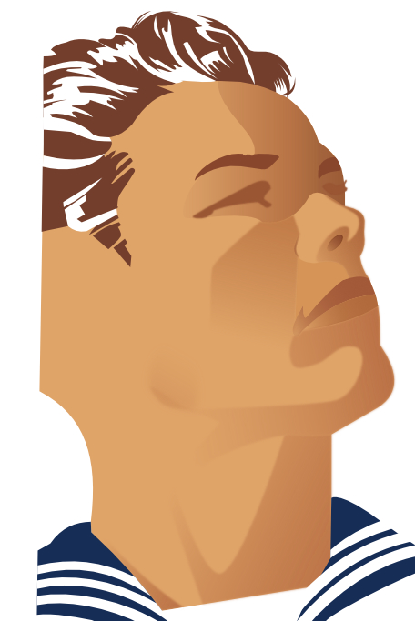
← Home ← Back to /gd/

Thread 459301

58 posts 56 images /gd/
Anonymous No.459301 [Report] >>459302 >>459304 >>459305 >>459311 >>459331 >>459357 >>459378
what's the name of this design? how does one achieve the composition and the colors in illustrator? is it even in illustrator since it's made in early 1900s.
Anonymous No.459302 [Report] >>459303
>>459301 (OP)
Anonymous No.459303 [Report] >>459308
>>459302
the contrasts looks very distinct
Anonymous No.459304 [Report]
>>459301 (OP)
Look up art deco propaganda/advertisements, art nouveau advertivements, and constructivism art and advertisements. You will like it.

>how does one achieve the composition and the colors in illustrator?
Basically you should study these styles, art composition, color theory, etc.
Anonymous No.459305 [Report] >>459324
>>459301 (OP)
Based style, you should make some motivational posters for /pol/ to keep the brethrens spirits strong
Anonymous No.459308 [Report] >>459309
>>459303
That type of color saturation, contrast, opacity and general tone is characteristic of gouache paints and illustrations made with them....at the time when hand illustrations were still the norm (photo printing was expensive) and printed media likecmagazones and posters became cheap to mass produce, gouache was to go-to medium because of its speed and adaptability to a wide range of techniques...it can go on thick/opaque like oils or acrylics or be thinned to act like watercolor.
Lots of image editors have gouache filters, but learning how and why it was used is best if you want to get that effect.
Anonymous No.459309 [Report] >>461890
>>459308
Another characteristic of many vintage gouache illustrations was to really emphasize the main subject of the image with heavier opaque application and then use a lighter and more transparent sketch-y application to fill in background detail and color to balance the composition and mimic natural vision.
Anonymous No.459311 [Report] >>459312 >>459323
>>459301 (OP)
FYI, since accuracy is important when researching this kind of thing, they didn't have radar or jets in the early 1900s and the first purpose built USN aircraft carrier was commissioned in 1934.

That's a WW2 era carrier and post WW2/Korean/ Cold War era jet silhouettes ...that poster is from 1947-1958 and almost certainly done by this guy-

https://en.m.wikipedia.org/wiki/Joseph_Binder_(graphic_designer)

Note that he wrote a book called "Color In Advertising"-

>"The book begins with the statement "Colour is the poster-painter's chief means of creating effect." This statement holds true in Binder's own work, as well as his assertion that that color harmony must be a harmony of contrasts if a poster is to hold the viewer’s attention. Binder advises designers to consider color's physical and psychological factors. Citing Newton and Goethe, he suggests that the optical illusion of an afterimage shows that the eye is capable of producing color on its own and this connects to “our innermost human disposition. We need green to free ourselves from red. We need yellow to counterbalance blue.” Regarding the psychological effects of color, Binder forwards the idea that changing the natural colors of objects, if done carefully, can create an element of surprise."

Lots more cool examples of his and others work of that era'

https://www.history.navy.mil/our-collections/art/exhibits/conflicts-and-operations/navy-recruiting-posters-of-the-atomic-age.html
Anonymous No.459312 [Report]
>>459311
More background and examples on Joseph Binder

https://eyeondesign.aiga.org/seminal-designer-joseph-binder-is-proof-that-even-legends-escape-wikipedias-notice/
Anonymous No.459316 [Report] >>461867
Anonymous No.459323 [Report] >>459329
>>459311
is that book available online?
Anonymous No.459324 [Report] >>459355
>>459305
that's why I'm learning
Anonymous No.459329 [Report] >>459332 >>459403
>>459323
I did not find it, but there is this one "Joseph Binder : an artist and a lifestyle : from the Joseph Binder Collection of posters, graphic and fine art, notes, and records"
https://archive.org/details/josephbinderarti0000bind/mode/2up

and there is some pages of the book Colour in Advertisement here:
https://collections.vam.ac.uk/item/O1743728/colour-in-advertising-book/
Anonymous No.459331 [Report] >>459349
>>459301 (OP)
Alrighty:
Start with the stencil work
Your going to want to use flat simple vector objects the best and most authentic way is to cut it by hand from an image reference. I was lazy and used brightness contrast to get a 1 layer bitmap.

Next up is an airbrush layer. Your going to want to cut more stencils and use the blur tool on them for the fades in and out. I'd suggest 1 layer of fine detail, one for shadows and lastly one for fills. Again I failed by blurring the whole object, you only need a part of it.

Lastly you can grain merge with a paper texture or use Photoshops in house paper effects.
SAGE No.459332 [Report] >>459336
>>459329
I found a document at the bottom of this website but not sure how to download it. There's some artwork and instructions
https://www.josephbinderaward.com/joseph-binder
Anonymous No.459336 [Report] >>459344
>>459332
Here it is, dude> https://anonfiles.lat/f/?id=30180302dfec48b568eee746553b4f3c
Anonymous No.459344 [Report]
>>459336
Danke fren :DD
Anonymous No.459349 [Report] >>459350
Its not that >>459331 is "wrong" or that his techniques aren't valid or useful but the result is clearly not the same, mostly because of using a "stencil" approach...the Binder posters definitely used masks to create certain effects but there's little if any stencil- like keyline like in that anon's example.

Binder's style is a prime example of *posterization*, which is more about reducing the number of colors used within an image...it can be done manually or photographically and is in many cases an inherent effect of the printing process used and how the colors are separated.

To do it digitally, tweaking brightness and contrast and exposure can help to eliminate more subtle gradations and give the feel of reduced color depth, but it's not the same as what you get with a "posterize" filter or adjusting color depth downwards. When done digitally you can get weird banding artifacts so blurs can help reverse that and still keep those colors reduced but not to the point of looking like stencils.

Most gouache effect filters are essentially doing posterization with some saturation change to mimic it's more opaque nature.

Picrel is not identical to the look of Binders posters but as you can see limits the color pallette and simplifies detail the same way without having any stencil-y keyline
Anonymous No.459350 [Report] >>459351
>>459349
Another example of a photo image posterized using multiple passes through a gouache filter interspersed with tweaks to saturation and brightness/contrast used to wash out and blur color details.

Again, not saying its *the* way to do it and its also a quick/lazy effort...its just for comparison with the other method suggested and the original pics.
Anonymous No.459351 [Report] >>459352
>>459350
One more...obviously if you are working from photos the original values matter and a lot of the brightness and exposure effects to create bold contrast can be done at that stage...more light and exposure can posterize photos in the camera, and it's actually a problem when you don't want it.
Anonymous No.459352 [Report]
>>459351
Also just to be clear you absolutely can use a dark keyline when creating posterized graphics with reduced color palettes, it's very common especially with screen printing...it's just that they tend to make the image look more cartoon-y than the painterly look of those Binder posters, if that's what you want to emulate.
Anonymous No.459354 [Report]
Depends whether you are making them from scratch, trying to reproduce them, or use them as reference images.

So these are simple litho prints, and there's a number of features of them
1. the texture.
This is simple, in illustrator you can just apply the litho texture as an overlay across the whole document. A somewhat better way is to apply it only to printed sections (so not the background).
2. defects
Always a post edit, you just add scratches, blots, blurs as a mask.
3. the trace, which is a simple trace, autotrace can often handle it if you stack objects
4. the fades, which you can add to the object, or as overlays.
Anonymous No.459355 [Report]
>>459324
nta, but i appreciate your efforts.
Anonymous No.459357 [Report] >>459360 >>459495 >>461891
>>459301 (OP)
Vectors would be the best way to do it yes. Use one base color for the face then use internal shapes for the shading. You can fade them out with gradient masks.
Anonymous No.459360 [Report] >>459369
>>459357
step by step webm
Anonymous No.459364 [Report]
>>459361
kys troon commie
Anonymous No.459369 [Report] >>459495 >>461891
>>459360
I don't know how. Just use basic vector techniques. Loads of tutorials on youtube. As someone else mentioned The bottleneck wouldn't be the technique; it would be having the imagination to come up with the themes, characters, and the composition.
Anonymous No.459378 [Report] >>459384 >>459385 >>459389
>>459301 (OP)
they stopped this type of propaganda style in the 80s for no reason
Anonymous No.459384 [Report]
>>459378
>for no reason

"Thanks to Nagel’s partnership with Mirage Editions and the fine art printer Jeff Wasserman, screenprints of the Nagel woman adorned the walls of many of the era’s bachelor pads, her manicured blankness chiming with the black-and-chrome minimalism of the day....

But, like much things from the ’80s, the Nagel woman soon descended into kitsch. By the end of the decade, every low-rent nail bar and beauty salon featured Nagel-style illustrations on their walls and in their windows, and the look became visual shorthand for tacky mall art."

"Nagel prints flooded the market in the 1980s. Nagel's manager, Karl Bornstein, president of Mirage Editions Inc., continued publication of Nagel's works after his death, including open edition prints and mass-market posters. In addition, in 1991, the FBI discovered and dismantled a counterfeiting ring which flooded the market with forged serigraphs. While this contributed to Nagel's cultural ubiquity—Nagel artwork was in a reported two million homes worldwide—it also served to exploit the brand and ultimately, dramatically lowered its value."
Anonymous No.459385 [Report] >>459389
>>459378
Because that is propaganda that looks like propaganda. You guys nowadays have the more impressive, powerful and far-reaching propaganda apparatus and it seems like there is none for the common folk.
Anonymous No.459389 [Report] >>459404
>>459378
>>459385
LMAO
Anonymous No.459402 [Report] >>461891
>>459361
Anonymous No.459403 [Report] >>459405
>>459329
Anywhere to download that first book.
Anonymous No.459404 [Report] >>459417
>>459389
Are you comparing political advertisement with propaganda?
Anonymous No.459405 [Report] >>459408
>>459403
anna's archive
Anonymous No.459406 [Report]
>>459361
Tesst
Anonymous No.459408 [Report]
>>459405
Cheers.
Anonymous No.459417 [Report] >>459427
>>459404
>political advertisement
>not propaganda
Anonymous No.459427 [Report] >>459453
>>459417
Advertisement is showing that image and saying "did you catch the reference? I am the new Obunga, please vote for me". Propaganda is making people in the other side of the world believe USA is "the biggest and oldest democracy of the world". Propaganda is controlling every movie that shows anything with more firepower than a pistol in it. Btw are you old enough to remember that until about 15 years ago anything bad was because of the russians and nowadays they are perceived as based and redpilled by your average boomer neighbout? Do you think it was achieved by showing beautiful pictures in a wall?

Those old army images were made to create a certain zeitgeist with the people, but it is too on the nose and is not that efficient abroad. Army images nowadays serve as advertisements, but the whole government apparatus work to spread their army propaganda abroad and it does work much much better than a couple of beautiful pictures.
Anonymous No.459451 [Report] >>461891
how to achieve a style like this?
Anonymous No.459453 [Report]
>>459427

Hahaha, dude in picrel even "has a pen and a phone" just like his Maoist compatriot Obama-

Great Leap Forward (1958-1961)
https://chineseposters.net/themes/great-leap-forward
Anonymous No.459454 [Report] >>459465
Obama's press secretary decorates home with Soviet propaganda
https://theweek.com/speedreads/455119/obamas-press-secretary-decorates-home-soviet-propaganda

>Dunn served as former president Barack Obama’s communications director from April to November 2009, when she resigned following controversy surrounding her comments on Mao’s determination to conquer China and establish a communist regime.
https://freebeacon.com/politics/forced-from-obama-admin-for-praising-mao-anita-dunn-to-return-to-white-house/
Anonymous No.459456 [Report] >>459458
>>459452
Thanks for confirming my point: The Obunga and Harris image were meant to sell them. It was not made to influence the zeitgeist.

Advertisement you sell a product, in your examples, the candidates.
Propaganda you spread an idea, be it inside or outside.

Also, claiming Harris that ran in a "I am 2016 Trump, please vote for me" platform and Onubga "we can drone strike your home if you think about not using the dollar" are communists is crazy believe system. Also, take a look at your few commie americans, none of them wanted to vote for kamala to the point liberals are claiming that she lost because of them.
Anonymous No.459458 [Report] >>459459
>>459456
LOFL, retarded shill is retarded.

>Advertisers use propaganda techniques to convince consumers to spend money on what they consider ‘appealing.’ These different forms of propaganda may seem silly, but they are quite effective when implemented. Many leading brands have utilized them previously and are currently employing them in their advertising campaigns.
https://prolificstudio.co/blog/propaganda-techniques-in-advertising/

>Advertising propaganda can be found in a variety of media, including print, radio, television, and online advertising. It is often used by corporations, political groups, and other organizations to promote their interests, products, or services.
https://www.batterseawebexpert.com/blog/types-of-propaganda-used-in-advertising/

>Glittering generalities is a technique used in propaganda and advertising to evoke positive feelings and associations with a product or idea. This technique relies on the use of emotionally charged words that have no real meaning but can influence people’s opinions.

>It is used to create an emotional connection between the audience and the product or idea being advertised. It is often used in political campaigns, where candidates will use words such as “hope”, “freedom”, and “progress” to evoke positive emotions without providing any concrete evidence of their plans for change.
https://medium.com/@stephentaylorpropaganda/types-of-propaganda-in-advertising-bf4e443006f8
Anonymous No.459459 [Report]
>>459458
I mean, it is kinda hard when you prove my point but think you are the one right here, but ok.
I will try the last time and will use your examples here:

There can be pure propaganda but don't pure advertisement as in the modern age any ad don't sell only a product but a sentiment. That being said, those perfume ads are the epithome of "advertising propaganda" as they sell a product but 99% of the ad is showing how you should feel with it.

You considering that Obama is a commie, that he is very far different than a republican, etc, was built on propaganda. Was it a couple ads you saw? No. Was it trying to sell you a product? No. It was a well crafted subset of ideas spread by a large group composed by the planers, the inside group who spreads, the LARPERs and the true believers. Lets use the Trump-Russia election interference example: It was thought by a group, then the briefing was hand out for the owners of big media people (these people know exactly their place), then handed out for the big names of big media that spread it in their news programs (some believe, some don't, but they play the same game), and then it comes the job for the LARPERs that believe spreading it will benefit them and the true believers to spread it in a myriad of platforms IRL, online or whatever. Oh was posters on a wall needed? No. This propaganda had any aesthetic attached to it? No. That does not mean that propaganda does not benefit by art or by an aesthetic characteristic, but they are different things.

Advertisement and propaganda can be in the same piece, but they does not mean the same. "oh but i found a retard who says it does" ok man, believe what you want to believe, but knowing your enemy makes you at least more prepared to not fall for blatant propaganda.
Anonymous No.459465 [Report] >>459474 >>459475
>>459454
omg you guysss, did you hear that someone said that one of the thousands of people that worked for Obama was a communist? that totally means that Obama is a comunist tooo!!!!

>elon does nazi salute in front of the whole world
>noooooo, he was just giving his heart to peopleee

yep, totally /pol/ incel logic
Anonymous No.459474 [Report]
>>459465
>/pol/ incel logic
Sir, this is /gd/. You need to touch grass.
Anonymous No.459475 [Report] >>459479
>>459465
Anonymous No.459479 [Report]
>>459475
WHAT??? OBAMA, HILLARY, AND HARRIS DID THE NATZII SALUTE?????

I can't believe my eyes, there must be video of this...
Anonymous No.459495 [Report] >>459529
>>459357
>>459369
I'm having trouble doing this in vector just with gradient blocks because of the edges.

Issue is that some edges have to be feathered/gradient while others must remain hard.
So your chin for example, it needs a hard edge where it intersects the white space of the canvas. And your shading on the upper nose should be soft.

I've tried setting the objects to lighten/darken so the gradient doesn't burn the canvas, the effervescence option is good when you want no hard lines.

As a raster editor it's extraordinarily frustrating not to be able to just brush in contours, I often resort to post-edit with rastor
Anonymous No.459529 [Report] >>460128
>>459495
You could have a foreground shape on top to retain the hardness.
Anonymous No.460128 [Report]
>>459529
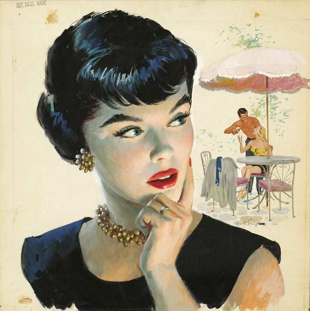
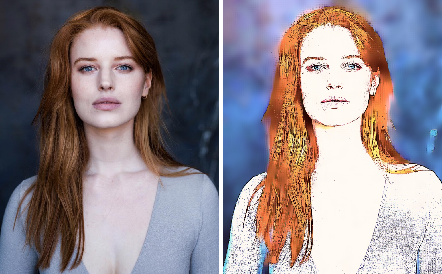
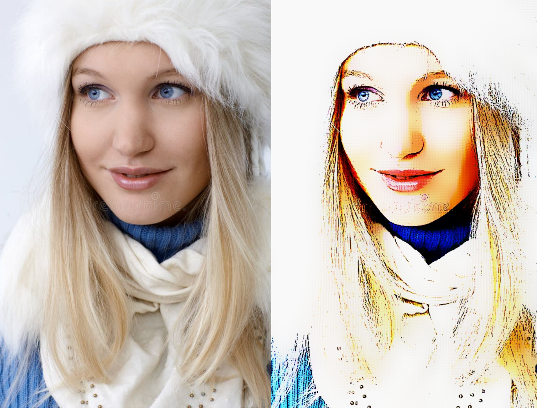
I count at least 15 defects in that section alone. The issue is consistency, you must be consistent in your technique or every element looks like garbage.

For example you can use a hard outline against gradient blocks to preserve your hard corners, that's valid, but if you do that you have to do it everywhere and not mesh other gradients.
If you mesh gradients and lose your hard internal edges, you have to loose them more or less everywhere, the shadow under the chin is meshed but the one above the lip is not, so both look like trash.

If your image has one point shadow (this one does), you can't then back-shaddow to achieve a gradient. So in this image the nostril shadow is consistent with the one point shadowing of the chin and the image overall; but the backs hadow from behind the nose seems to come from nowhere and be cast in no drection. Shadows are always cast, they are not the "color" of the skin area.

And it may seem like I'm being picky; but that's what this style and design is, that's what separates an artists work from AIslop, it's the consistency of technique. There is no right or wrong way to vector, but there are styles, and AI generates civually so just uses a total slop of styles, it just uses the best visual match, it doesn't know how to interpret images the "wrong" way so as to preserve the overall style of a work.

I make this point often, to clients, in defence of hand drawn work of many styles. Mixed technique is a dead give away of AI rendering and it looks both sloppy and generates progressively weaker assets. When you accept these errors, you accept a cascade of errors, and AI just eats it's own stylistic errors over and over until you get the classic degenerate art form we all associate with globohomo.

I'm hardly a master of vector art, but that's the underlying reason it should be respected and why it is used in virtually all commercial contexts
Anonymous No.460458 [Report]
any video tutorials?
Anonymous No.461867 [Report]
>>459316
Anonymous No.461875 [Report]
Anonymous No.461890 [Report]
>>459309
Superman with the black hairdye
Anonymous No.461891 [Report]
>>459357
>>459369
Looks great, that's exactly what hair does. Gotta ask, would you say white people are bage ("beige") like bagels?
>>459402
>>459451
Germany is in NATO/Europe nowadays
Anonymous No.462641 [Report]
mm