I hate the brutalist design
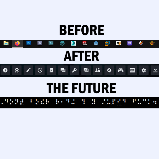
Icons back in the day used to be colorful, in varying shapes etc, being immediately recognizable.
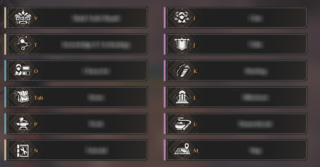
Around 2015 or so, everything went black and white for some reason, turning into monochrome, silhouette icons.
Why would you remove distinct features of icons? (Attempt to decipher the icons in the middle row in the picrel without hovering over them for descriptions.)
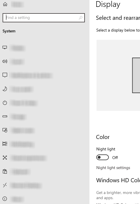
Worse, This light/dark mode shit gets on my nerves. You have two options, blinding white or pitch black. Before chrome infamously got rid of "chrome" bars on your screen, our ancestors had arcane knowledge about this color: grey!
It has been 10+ years with this crap design, why does it still persist?
I cant wait for it to die! :(
Around 2015 or so, everything went black and white for some reason, turning into monochrome, silhouette icons.
Why would you remove distinct features of icons? (Attempt to decipher the icons in the middle row in the picrel without hovering over them for descriptions.)
Worse, This light/dark mode shit gets on my nerves. You have two options, blinding white or pitch black. Before chrome infamously got rid of "chrome" bars on your screen, our ancestors had arcane knowledge about this color: grey!
It has been 10+ years with this crap design, why does it still persist?
I cant wait for it to die! :(