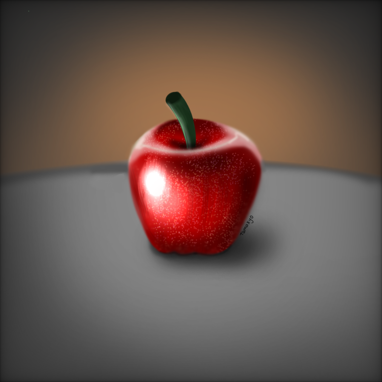
Thread 7611286 - /ic/ [Archived: 756 hours ago]

Tamakyo
6/16/2025, 12:54:45 PM No.7611286
apple_20250616123523
md5: ae2e111f88e78af136c105b479f10d26🔍
I accept any criticism, I am still trying to improve.
Replies: >>7611292 >>7612765 >>7612791 >>7612796 >>7615609 >>7615614 >>7619391 >>7619445 >>7619770 >>7619804 >>7623920
Anonymous
6/16/2025, 1:08:31 PM No.7611292
>>7611286 (OP)
grab meds map from the vct and start anew
Anonymous
6/17/2025, 4:56:03 PM No.7612758
Whats with begs signing every shitty doodle they make
M
6/17/2025, 5:00:01 PM No.7612765
>>7611286 (OP)
The rendering looks okay but you should have put more time into making your shapes accurate. It seems like you skipped ahead to the polishing stages without giving the foundation of your drawing enough time. Work on your shape accuracy before focusing on colors and special effects.
Anonymous
6/17/2025, 5:00:13 PM No.7612766
don't sign your shitty studies, it makes you look like a self obsessed dunning kruger
also squint more, values are shit
Anonymous
6/17/2025, 5:43:21 PM No.7612791
>>7611286 (OP)
How come I can see the top of the apple when IM looking at it directly from the front? Fix it that.
Replies: >>7615619
Anonymous
6/17/2025, 5:46:11 PM No.7612796
>>7611286 (OP)
Why is the apple so blurry? Things have edges. Also, the stem is ginormous!
Anonymous
6/20/2025, 9:35:53 AM No.7615609
>>7611286 (OP)
nice apple
Anonymous
6/20/2025, 9:37:50 AM No.7615614
>>7611286 (OP)
Blurry edges but sharp texture looks odd
Should be the other way around
Anonymous
6/20/2025, 9:41:29 AM No.7615619
>>7612791
lmao you're bad at this. learn from the other comments
Anonymous
6/20/2025, 9:56:39 AM No.7615630
here's what's good:
you did well with the top of the apple. The lighted area creates an illusion of form and looks really good. I also like the red colours you picked for the apple.
The shading is also competent from a value standpoint. I like the little dots.

here's what you need to improve:
- Shading looks best if it's a combination of soft and hard edges. As others have pointed out, it overall looks a bit blurry, so try to make some harder edges at the outer edges.
- The bottom of the apple looks 2D, so try to give it more volume. Use T-Lines and curves to do that.
- The stem is too big
- the background is way too simple. It distracts from the apple. Spice it up with some light effects or add a red drop shadow (cast from the apple to the surface).
Overall, not too bad. It looks pretty solid from afar.
Anonymous
6/23/2025, 8:11:20 PM No.7619391
>>7611286 (OP)
I really really like the rendering but when you close up on it there's a bit too much grain kinda makes it look like a plastic apple.
The stem is too broad, and the bottom of the apple looks unrealistic but overall, it's okay
Anonymous
6/23/2025, 8:53:39 PM No.7619445
>>7611286 (OP)
Draw from life
- shape is not like an apple
- stem is too big and unnatural
- bottom looks unrealistic and obviously symbol drawn from memory

Then we have the color and light issue
- highlight is brighter than main light.
- shadow chases the rim of the apple instead of the form
Too much pillow shading.
Shadow doesn't follow light

What I like:
Beautiful vivid colors
Soft background matches intensity of the apple
Nice contrast
Texture on the skin attention to detail
Anonymous
6/24/2025, 2:31:30 AM No.7619770
>>7611286 (OP)
I think it's pretty neat
Anonymous
6/24/2025, 3:04:22 AM No.7619804
>>7611286 (OP)
You need Loomis. Go practice drawing boxes in voids
At least 100 a day or you will ngmi
Anonymous
6/27/2025, 10:59:38 PM No.7623920
null
md5: null🔍
>>7611286 (OP)
something about this apple has a goofy weird aura to it. Like some shit I'd see on instagram reels with the superimposed papyrus text
Anonymous
6/27/2025, 11:11:19 PM No.7623925
284659245254
284659245254
md5: da99db9b4e65e7ee125ebeea1dec8136🔍
reminds me of papyrus irony