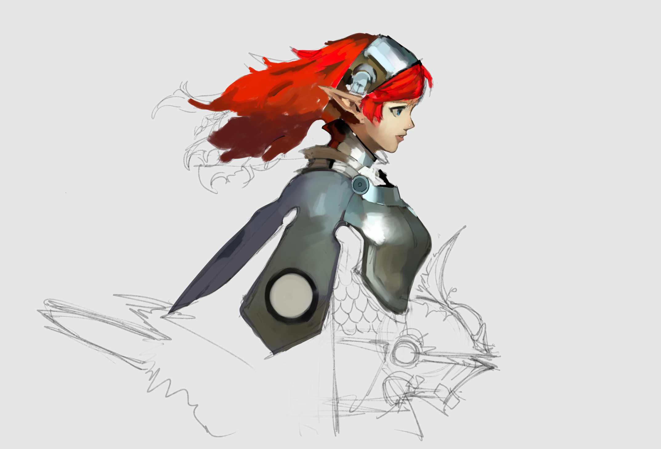
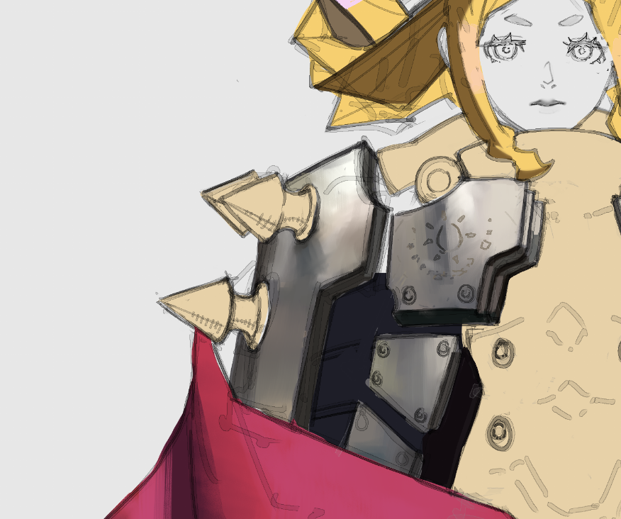
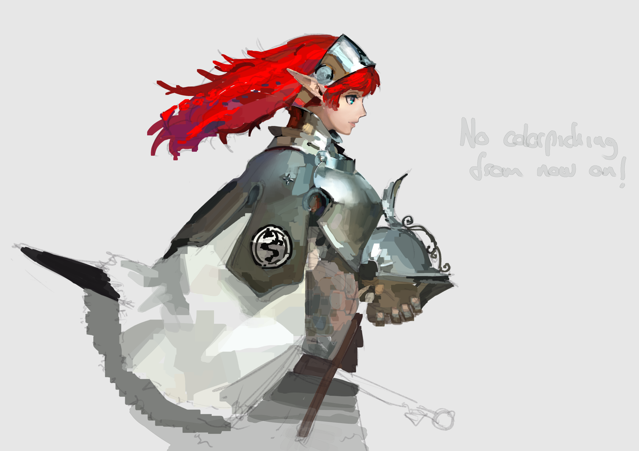
>>7666781it's a pretty good attempt and if you just put more time you basically got it desu.
The begtrap you want to avoid, is making the whole thing look like a muddy gradient.
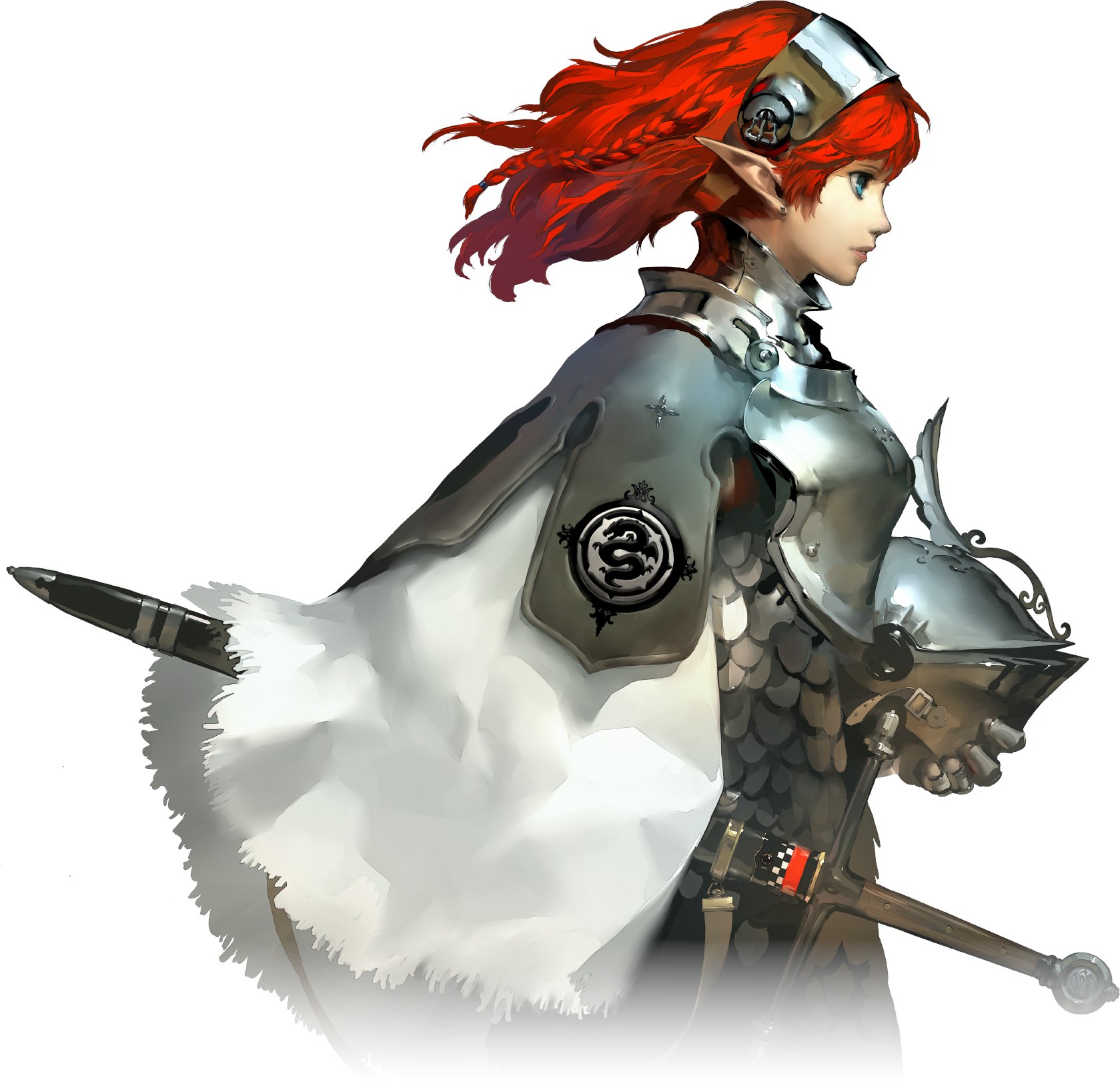
First, do what you already did, use a hard brush and establish large patches of value (like the brightest spot on her chest next to the darker front of the chest). Make sure the values of each chunk are distinct enough from each other that you can easily tell where one ends and the next begins.
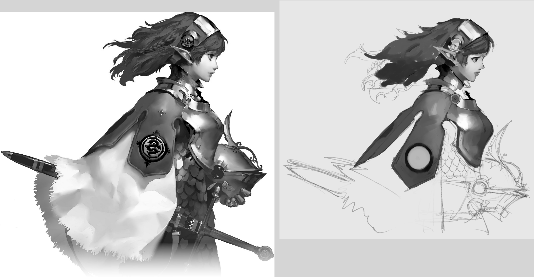
Once you've achieved that for the whole picture, then you can grab a soft brush and start trying to blend those transitions, but ONLY the transitions. Don't blend the whole thing into mud. Basically, you want it so when you look up close, it looks smooth, but when seen from afar you can still tell apart the different sections. Using your ref image as an example, when you zoom in, all transitions seem smooth, but when looking at it at thumbnail-size, you can very clearly tell apart the shiny breastplate spot from the rest, or the darker neck from the brighter face.
Another area that's harder, and I'm personally still struggling with though, is knowing where to leave hard edges. One example I understand, is how right below the ear he made the skin smoother, but as soon as it reaches the jaw, he left a harder separation of value so we can tell the jaw bone apart (since it's further out than the neck), but no idea why the armor is all smooth but the headband piece was left chunky, or that curvy piece at the top of the breastplate.