>>4429488 (OP) I hate cellphone denoising filters
>>4429491 cute but lacking in composition, eye is guided nowhere
>>4429495 could be nice if colors weren't blown out, clamped white and green, makes it look like a stylized painting though.
>>4429508 Composition should have been centered and focused on the gentleman's face, so that we can briefly read the sign and focus on his content face. would be better in black and white too as everything in the picture doesnt look too modern, could pass it as an old school picture, more mature.
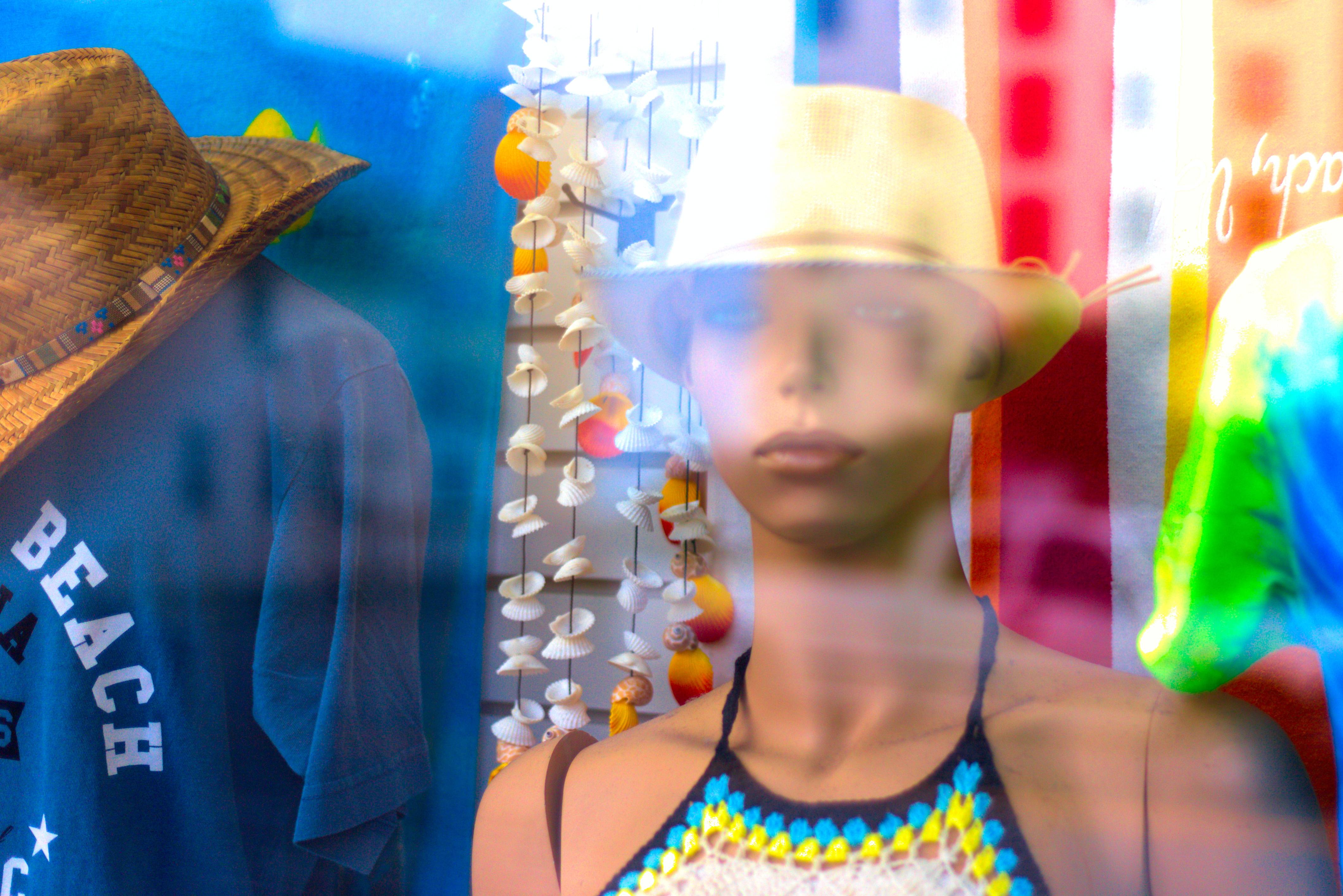
>>4429510 boring, doesnt tell a story nor looks visually appealing with the big reflection. colors remind me of 2008 low budget television series though, bit nostalgic I guess. Putting the focus on the blue shirt gives her a smoothed out look, maybe something interesting do be done with this technique.