Search Results
6/15/2025, 6:45:01 PM
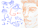
>>7610051
Remember what I said:
"Careful use of "C" "S" and "I" lines is enough."
"The main thing to keep note of is that when those lines interlock, they need to form a "T" (the "T" can be curved as well), because that is what separate one line from another."
In the drawing that you posted there is a lot of tangents, not enough overlapping or interlocking.
Which leads to a symbolic drawing instead of conveying form through the lines themselves.
See edited image that I will post.
I tried to do my best to show some overlapping and interlocking between these lines (the one example with red lines was to show something I would avoid).
"But why C S and I specifically?"
Well, for one, they are easier to remember, easier to draw and they keep the concept simple.
This, and the first two letters deal with curves, and the other one is straight.
In any illustration, you'll mainly deal with curves and straights.
So it's good to practice this to simplify the process. :)
Anyway, having said all that, it's not like you NEED to do this to convey volume without painting and all.
You can use hatching such as Katsuya Terada often does or Kentaro Miura.
But you can definitely use only these lines to convey volumetric forms as well.
Well, I hope if this is useful, again.
If not, I don't mind it, but wish you guys all the best.
Have a good day.
Page 1