Search Results
6/19/2025, 7:21:52 AM
>>527944917
My favorite logos and why
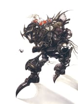
Final Fantasy VI: The first logo that truly communicates with the player the games themes and more mature content. The magitek armor and dark color scheme with the (female) warrior on top shows the adventure you're about to go on combines traditional fantasy elements with new age science fiction elements and a darker, more realistic portrayal of war (kino)
Final Fantasy VIII: The first to depict two people, it shows the protagonists loving embrace. The warm tone of the gold overtaking the image is a series first, and it directly shows the player way that the heroes darkness is filled with light (kino)
Final Fantasy X: Similar to VI and VIII before it it showcases the setting and theme of the game marvelously, with the blue heroine of the ocean seemingly at war with the fire of Chaos/Sin in a neverending Spiral (kino)
Final Fantasy XIII: The cool aqua tones and round shape of the logo are reminiscent of the meteor from VII, but the thematic integration with the story is even more incredible and detailed. The payoff of the logo being the ending of the game is a beautiful integration unlike something I've ever seen before. The two guardians of the world (Fang/Vanille) and the steed (Eidolon/power of L'Cie), Cocoon and the column underneath it. When you first see it, you don't see anything. Same with Serah's necklace. But once you've completed the game, you can see everything (kino)
Final Fantasy XV: This logo will always be perhaps my favorite of all time and once again has elements of almost everything I've mentioned before. The way the light of the moon (heroine) lights the darkness of the cloth/fabric of the universe (Chaos). The woman, asleep but waiting, watching, ready to awaken. The dark wing, the cloud over the land. The small dragon representing Astrals. It's all there and is the peak of the series when it comes to logo design that is striking, memorable, iconic, and communicates effortlessly.
My favorite logos and why
Final Fantasy VI: The first logo that truly communicates with the player the games themes and more mature content. The magitek armor and dark color scheme with the (female) warrior on top shows the adventure you're about to go on combines traditional fantasy elements with new age science fiction elements and a darker, more realistic portrayal of war (kino)
Final Fantasy VIII: The first to depict two people, it shows the protagonists loving embrace. The warm tone of the gold overtaking the image is a series first, and it directly shows the player way that the heroes darkness is filled with light (kino)
Final Fantasy X: Similar to VI and VIII before it it showcases the setting and theme of the game marvelously, with the blue heroine of the ocean seemingly at war with the fire of Chaos/Sin in a neverending Spiral (kino)
Final Fantasy XIII: The cool aqua tones and round shape of the logo are reminiscent of the meteor from VII, but the thematic integration with the story is even more incredible and detailed. The payoff of the logo being the ending of the game is a beautiful integration unlike something I've ever seen before. The two guardians of the world (Fang/Vanille) and the steed (Eidolon/power of L'Cie), Cocoon and the column underneath it. When you first see it, you don't see anything. Same with Serah's necklace. But once you've completed the game, you can see everything (kino)
Final Fantasy XV: This logo will always be perhaps my favorite of all time and once again has elements of almost everything I've mentioned before. The way the light of the moon (heroine) lights the darkness of the cloth/fabric of the universe (Chaos). The woman, asleep but waiting, watching, ready to awaken. The dark wing, the cloud over the land. The small dragon representing Astrals. It's all there and is the peak of the series when it comes to logo design that is striking, memorable, iconic, and communicates effortlessly.
Page 1