Search Results
2/7/2025, 4:05:00 PM
>>459597
I think the bottom head is better general, but you should use both teeth. Top teeth for regular use/sizing of the logo, bottom teeth for reduced size use. If you have to pick just one: bottom one.
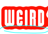
Also, i like the lettering, but i think the waves should have more thought than just to apply a stroke. This bottom part is a good example: we have this waves, then there is some very subtle waves at the bottom of IRD mainly.
Page 1
