Search Results
6/21/2025, 12:15:33 AM
>>149083983
It's like food, the most important thing is that it tastes nice. You want the food to look nice also, and this can be an art form, but if you ever make the food taste worse in the name of making it look pretty, you have gone horribly wrong and forgotten the point of food.
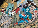
My complaint with the Death of Superman camera lans page is that it's confusing. Your eye is first drawn to the eyes of the photographer and Superman in the camera lens is hard to make out. It would have been so much more impactful if they had just gone with pic related as the climactic moment (but with the prior scene of Superman dying of course). I suspect the artist thought that would be too standard, too boring, but the result is a poorly executed page that is read as follows:
>turn page
>oh a photographer-
>-oh Superman is inside the lens! what a clever composition on the artist's part, anyway back to the story
The raw experience of the moment is robbed from the viewer in this way by such an overt and distracting composition.
It's like if you were listening to a piece of music and right at the climax of the song, it suddenly cuts out for a fraction of a second, your immersion in the song is broken and you're robbed of the experience.
tl;dr, it's just not a smooth reading experience, it would have been better if the camera lens was in colour and much more zoomed in, with the photographers reaction being cropped out, and then another shot on the next page showing the same thing but zoomed out.
>immersion becomes less and less of a thing.
oh come now, you don't really believe that do you? What a jaded view
That's like saying that that music isn't supposed to convey emotion but merely sophisticated melodies that can be appreciated from an academic perspective.
These are art forms, they are important to us because they are emotional, they make us feel things.
It's like food, the most important thing is that it tastes nice. You want the food to look nice also, and this can be an art form, but if you ever make the food taste worse in the name of making it look pretty, you have gone horribly wrong and forgotten the point of food.
My complaint with the Death of Superman camera lans page is that it's confusing. Your eye is first drawn to the eyes of the photographer and Superman in the camera lens is hard to make out. It would have been so much more impactful if they had just gone with pic related as the climactic moment (but with the prior scene of Superman dying of course). I suspect the artist thought that would be too standard, too boring, but the result is a poorly executed page that is read as follows:
>turn page
>oh a photographer-
>-oh Superman is inside the lens! what a clever composition on the artist's part, anyway back to the story
The raw experience of the moment is robbed from the viewer in this way by such an overt and distracting composition.
It's like if you were listening to a piece of music and right at the climax of the song, it suddenly cuts out for a fraction of a second, your immersion in the song is broken and you're robbed of the experience.
tl;dr, it's just not a smooth reading experience, it would have been better if the camera lens was in colour and much more zoomed in, with the photographers reaction being cropped out, and then another shot on the next page showing the same thing but zoomed out.
>immersion becomes less and less of a thing.
oh come now, you don't really believe that do you? What a jaded view
That's like saying that that music isn't supposed to convey emotion but merely sophisticated melodies that can be appreciated from an academic perspective.
These are art forms, they are important to us because they are emotional, they make us feel things.
Page 1