Search Results
6/19/2025, 8:33:18 PM
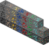
The original pre-1.17 Minecraft ore textures were objectively superior in every meaningful metric compared to the soulless, over-designed imposters we suffer today; the old diamond ore, for instance, wasn't just a cluster of pixels, it was a beacon of pure, unadulterated hope rendered in that blindingly saturated, almost radioactive blue that screamed "VALUABLE!", a visual siren song ingrained into the core memory of anyone who mined pre-1.17, whereas the new version is a muted, disappointingly subtle hint of blue lost amongst the stone like some apologetic geological afterthought – it lacks the punch, the immediate, visceral thrill. And don't get me started on coal: the old texture was a bold, high-contrast explosion of deep black pixels on grey, instantly readable even in the gloomiest corner, a satisfyingly chunky symbol of your imminent furnace-fueled progress; the new "improved" coal looks like someone smeared charcoal dust vaguely over the rock, requiring actual scrutiny, fundamentally disrespecting the player's time and the ore's vital, foundational role. Gold lost its distinct, almost sickly yellow sparkle, iron traded its unique, gritty, rust-speckled character for generic grey lumps, and lapis lazuli... well, the less said about that over-smoothed teal travesty replacing the beautifully noisy, deep indigo chaos of the original the better... These weren't mere textures; they were iconic, pixel-perfect glyphs of adventure, instantly recognizable relics from an era when mining felt raw, rewarding, and defined by stark, beautiful simplicity, not this homogenized, artistically timid nonsense that prioritizes subtlety over the dopamine hit of instantly spotting your quarry – the new ones are a downgrade disguised as progress, erasing visual history and proving, beyond any reasonable doubt, that the blocky ugliness we cherished was perfect precisely because it was ours, and changing it is an unforgivable betrayal of the game's soul.
Page 1