Search Results
6/17/2025, 9:33:55 PM
>>105623859
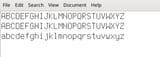
It looks perfect when small (12pt). When I enlarge it, though, it has this very subtle 3D effect. It doesn't look *blurry* like non-bitmap fonts, but it doesn't look like a proper bitmap font either. I don't know if I'm imagining it, but it does not look as good when enlarged. The 3D effect is the most pronounced at the very top of the character.
Terminus is also too rounded so it doesn't really let me see the detail of the font, which fucks with my brain.
Page 1