Search Results
7/24/2025, 9:07:44 PM
>>106006902
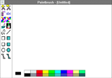
Sorry, anon. Borders are too visually aggressive. If they exist they cannot be more than 1px wide.
Elements need space to "breathe", we cannot separate them as this causes anxiety in users. So we need blank space.
The scrollbar will magically appear over the content when needed.
There's too many colors here, the user might get confused. It's best if we reduce the number of colors and let the user customize them if needed.
There's no need for a minimize button. Minimizing is an anti-pattern that we shouldn't enable. Closing the window is enough.
The title bar should be gray, not colored. Only in-app elements which can be interacted with should be colored.
Page 1