Search Results
8/10/2025, 3:17:21 AM
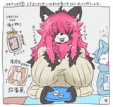
Looking at Shot One’s art style, I think I've identified the the main issue: it’s borrowing the “big, chunky shapes + vibrant colors + clean edges” aesthetic of Overwatch (and by extension, a lot of modern hero shooters), but then cranking the detail density up to 11. That’s where it starts to feel overdesigned — you’ve got a bunch of competing focal points on each character, which makes the overall read loud and visually exhausting.
The tonal mismatch is the other part of why it feels “off.” The bright, toyetic, Saturday morning cartoon style usually signals “all ages, safe fun” — and then when you bolt on more adult, sexualized design elements (like open thigh cutouts, belly exposure, or the way certain poses are framed), it creates a kind of visual dissonance. It’s not that those elements can’t coexist — anime has done “cute + sexy” for decades — but here, the cartoon hero shooter aesthetic doesn’t seem to integrate them naturally. Instead, they stand out as tacked-on features to make the designs “edgy” or “mature,” even though the base style isn’t built for it.
It’s kind of like if you redesigned the Teen Titans Go! cast but gave them all Bayonetta proportions and costume cutouts — the result would probably feel more awkward than alluring.
If I had to sum it up: the Shot One designs feel like they’re trying to serve too many masters — toy marketing clarity, competitive shooter personality, retro cartoon nostalgia, and modern pin-up appeal — and in the process, they’ve made characters that are technically competent but aesthetically unfocused.
Page 1