Search Results
7/3/2025, 12:46:40 AM
>>7629920
It’s kind of complicated to explain because there’s many ways to do it. It helps if you understand what’s actually going on. The colors have a vibrating effect because they don’t break the value structure but have different hues. There’s also specks of very contrasting color. Take a look at the cape. While there are various kinds of reds, the most striking parts are the contrasting blues and purples. Contrasting and layered hues are used everywhere in the piece. You’ll also note that the local colors are mostly desaturated so the little specks of purple or blue or green or (…) stand out more.
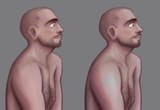
Picrel is something I did recently when bored, I was trying to make an old sketch more interesting. It’s not that great, but I added some more color variation. I brushed opposing hues in the highlights (off-white greens can make really good highlight colors) and some in the shadows. The “rainbowy” effect in other parts was a brush with the random-color jitter turned on. Little specks of pure color (like the red on the cheek) can be very effective to make things look more interesting, though I didn’t use it much here. You can also use layer modes (like Hue) to make adding these colors easier.
Krenz calls these “hidden colors”. He describes them in great detail in the latter half here:
https://asgg.notion.site/Color-pt4-2957b70a2c044376b586c093a33252b6
I recommend reading other notes of his course to understand. Also Marco Bucci uses this a lot so check out his YT.
It’s kind of complicated to explain because there’s many ways to do it. It helps if you understand what’s actually going on. The colors have a vibrating effect because they don’t break the value structure but have different hues. There’s also specks of very contrasting color. Take a look at the cape. While there are various kinds of reds, the most striking parts are the contrasting blues and purples. Contrasting and layered hues are used everywhere in the piece. You’ll also note that the local colors are mostly desaturated so the little specks of purple or blue or green or (…) stand out more.
Picrel is something I did recently when bored, I was trying to make an old sketch more interesting. It’s not that great, but I added some more color variation. I brushed opposing hues in the highlights (off-white greens can make really good highlight colors) and some in the shadows. The “rainbowy” effect in other parts was a brush with the random-color jitter turned on. Little specks of pure color (like the red on the cheek) can be very effective to make things look more interesting, though I didn’t use it much here. You can also use layer modes (like Hue) to make adding these colors easier.
Krenz calls these “hidden colors”. He describes them in great detail in the latter half here:
https://asgg.notion.site/Color-pt4-2957b70a2c044376b586c093a33252b6
I recommend reading other notes of his course to understand. Also Marco Bucci uses this a lot so check out his YT.
Page 1