Search Results
8/6/2025, 4:08:52 PM
>>96263094
the other troll anon didn't explain but in paintings often the highlight is cooler because it's reflecting the blue sky on an incredibly sunny day on an even slightly reflective surface. You can see this effect prominently on darker skin in the shade, where they're getting all the blue coating their face. And blue and purple are not complimentary or opposite colors. They're right next to each other.
Warm/cool has no inherent wrongness or rightness on shadows and highlights. It's about the environment you're simulating or the material you're making. And metallics almost always have a hue shift going on in their colors. Think gold in 2D paintings, how it always is an orangey brown to a yellow. And not a yellow to a brighter yellow.
Anon going from purple to blue to green is a fine idea and follows one path on the colorwheel and would visually look good.
You can do (purple and) blue to green too. And when I was coming up for a color scheme for cadians that looked cool but I was bored of green so instead I went green to blue.
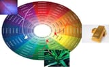
Here's a retarded image i made with a not so good color wheel but if you went into photoshop and messed around with the eyedropper tool you'll notice these colorwheel curves everywhere on everything. And they all take the same shape of these arrows, some are more shallow, some are longer etc etc. Nothing stays one exact hue from shadow to highlight. And from shadow to highlight things can travel clockwise and get cooler or travel anti-clockwise and get warmer. It just depends what you're recreating.
the other troll anon didn't explain but in paintings often the highlight is cooler because it's reflecting the blue sky on an incredibly sunny day on an even slightly reflective surface. You can see this effect prominently on darker skin in the shade, where they're getting all the blue coating their face. And blue and purple are not complimentary or opposite colors. They're right next to each other.
Warm/cool has no inherent wrongness or rightness on shadows and highlights. It's about the environment you're simulating or the material you're making. And metallics almost always have a hue shift going on in their colors. Think gold in 2D paintings, how it always is an orangey brown to a yellow. And not a yellow to a brighter yellow.
Anon going from purple to blue to green is a fine idea and follows one path on the colorwheel and would visually look good.
You can do (purple and) blue to green too. And when I was coming up for a color scheme for cadians that looked cool but I was bored of green so instead I went green to blue.
Here's a retarded image i made with a not so good color wheel but if you went into photoshop and messed around with the eyedropper tool you'll notice these colorwheel curves everywhere on everything. And they all take the same shape of these arrows, some are more shallow, some are longer etc etc. Nothing stays one exact hue from shadow to highlight. And from shadow to highlight things can travel clockwise and get cooler or travel anti-clockwise and get warmer. It just depends what you're recreating.
Page 1