Search Results
7/23/2025, 6:14:17 AM
>>149512857
>>149512969
>>149512999
The title cards for sure drifted away from their "made for a pulp magazine cover" origins but they still looked good all the way until the end to me. Probably the part of the series that was most consistently good for the show's entire run.
>>149513157
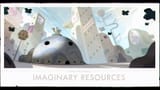
Holy shit what a nuts opinion, they're cool. The flat style gives it a brochure feeling which fits for how they were all about showing the locations/architecture of the islands, and most of the stuff they depicted was cool.
The worst title cards in the show are Stakes because THEY'RE ALL THE SAME FUCKING COLOR and "character facing the screen" is much less interesting to do stuff with vs Islands and Elements' themes.
>>149512969
>>149512999
The title cards for sure drifted away from their "made for a pulp magazine cover" origins but they still looked good all the way until the end to me. Probably the part of the series that was most consistently good for the show's entire run.
>>149513157
Holy shit what a nuts opinion, they're cool. The flat style gives it a brochure feeling which fits for how they were all about showing the locations/architecture of the islands, and most of the stuff they depicted was cool.
The worst title cards in the show are Stakes because THEY'RE ALL THE SAME FUCKING COLOR and "character facing the screen" is much less interesting to do stuff with vs Islands and Elements' themes.
Page 1