Search Results
2/19/2025, 5:20:36 PM
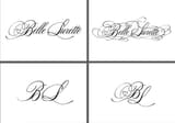
Hey, i'm working on the dev of a small clothing brand. I'm formaly trained as an industrial designer, but wanted to give a try and challenge myself. It's a slighlty modified Bibliophile Script font, but the more i take a closer look to the heart integrated to the "B" the more it seems odd or a bit floating. What would be your advices ?
Thanks :)
Thanks :)
Page 1