Search Results
6/22/2025, 7:49:26 PM
>>95929274
The thing that actually makes this style outside of pen choice is restriction to pen size and page size. In a traditional comic you'd be looking at the page size you're drawing for and no one is going to zoom in on the lines and the texture of the paper will prevent perfect smoothness throughout. So things scale a certain way because it's a real actual thing intended to be viewed at that size.
But with digital the tendency is to zoom in and out, to be working up closer to the image at times, for details in the margins to be thinner and lighter and no less detailed.
It's hard to describe what I mean. But if you draw with an image always at the same scale and pens imitating the thickness and texture of real pens, then that's how you get the ttyle. Add in the where's waldo level of detail where the concept of negative space is just "space I haven't gotten to yet". It's a busy style.
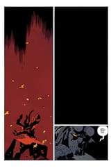
I'd contrast it to mike mignola with hellboy. Rough traditional lineart, but major emphasis on negative space and shadows. Colors have high contrast and balance between panels too. Entire panels left blank just for the effect. It's not a criticism of either of them, just a difference in design choice.
The thing that actually makes this style outside of pen choice is restriction to pen size and page size. In a traditional comic you'd be looking at the page size you're drawing for and no one is going to zoom in on the lines and the texture of the paper will prevent perfect smoothness throughout. So things scale a certain way because it's a real actual thing intended to be viewed at that size.
But with digital the tendency is to zoom in and out, to be working up closer to the image at times, for details in the margins to be thinner and lighter and no less detailed.
It's hard to describe what I mean. But if you draw with an image always at the same scale and pens imitating the thickness and texture of real pens, then that's how you get the ttyle. Add in the where's waldo level of detail where the concept of negative space is just "space I haven't gotten to yet". It's a busy style.
I'd contrast it to mike mignola with hellboy. Rough traditional lineart, but major emphasis on negative space and shadows. Colors have high contrast and balance between panels too. Entire panels left blank just for the effect. It's not a criticism of either of them, just a difference in design choice.
Page 1