Search Results
7/17/2025, 4:16:47 AM
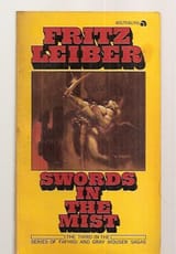
>>24557027
I like the direction. reminds me of the gray mouser covers
I don't like the round corners. maybe hard corners for the bottom, round corners on the top?
I agree with the sentiment of >>24557047 but I think you have a fine balance here
if you make the character art too small it'll turn into visual noise. as it is, the character art is immediately identifiable and you can make out the title. it's not completely clear but it is visually distinct unlike before
>drop shadow and black outline
it's that easy folks
Page 1