Search Results
6/10/2025, 12:21:54 AM
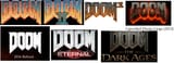
Not really sure if this counts as /vr/, but I was curious to hear the opinions on something. Anyone feel like the Doom logos kind of got worse as the series went on? (Nothing will ever beat the hand drawn logo's of the first 2 games.)
I think the Doom 3 logo is fine, it fits the theme of Doom 3, the cancelled Doom 4 logo I think is fine too, it fits the hell theme, but I fucking hate how the Doom logo looks starting with the 2016 Doom, its so fucking boring looking compared to the other ones, its just a flat white texture. I guess the Dark Ages one is alright, at least it is not that flat texture shit.
I think the Doom 3 logo is fine, it fits the theme of Doom 3, the cancelled Doom 4 logo I think is fine too, it fits the hell theme, but I fucking hate how the Doom logo looks starting with the 2016 Doom, its so fucking boring looking compared to the other ones, its just a flat white texture. I guess the Dark Ages one is alright, at least it is not that flat texture shit.
Page 1