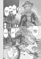
Same thing with 『Double Pop Blaster(Wind Reading Cannon)』, another place of unsure how to do, especially when it's with other text. Highlighting it too much by making it bigger looks off with the Tepaste in front. Maybe I should just keep the stuff all the same size for uniformity.
>>281344572
Well, for "" and (), should I keep them like that, or the moment for example I turn text with "" into bold and bigger and () as subtitles into smaller text, I remove these as well. I realized here for this page particularly I didn't do that, but honestly part of this QC is me trying a few things, seeing reactions and properly setting standards.
