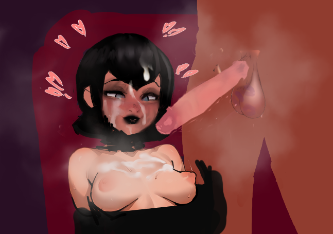
>>7694880
with women, less is more.
for a typically feminine impression, I find its better to keep your strokes/detail as low as possible, in or around the face especially.
the expression is cool , but you have lots of rigid black vertical lines, this looks horrible on women.
this takes away from her eyes, the expression.
the collar bones are floating, the hairline is weird, your light values on the breasts/clothes are too bright, you probably tried to fix problems as they appeared, the biggest thing I see is your values are all over, stop this habit early. try limiting value,
broken nose, the eyes have going off perspective alot
>>7695900
lot of loose clavicles today, kind of phoned it in on the shoulders.
the insertions are wrong, youre missing part of the breast form.
its not difficult at all to show you could have done a hard line on the bottom to help define the breast form
the eye perspective is going everywhere
the shoulder is broken, lateral delt is basically facing the viewer
quit wasting time adding these pointless contour lines of the lip and nose , the perspective and proportions already wrong anyway.
>>7702823
think of it in three shapes, base, shaft, glans.
keep bases thin, mid shaft always the thickest section,
one big vein down center
think of glans like a baseball helmet
this with reference will be enough with your erm.. sensibilities
4chan Search
1 results for "71cfed531aabe5576fc9aa8b72a2498c"