>>939427339
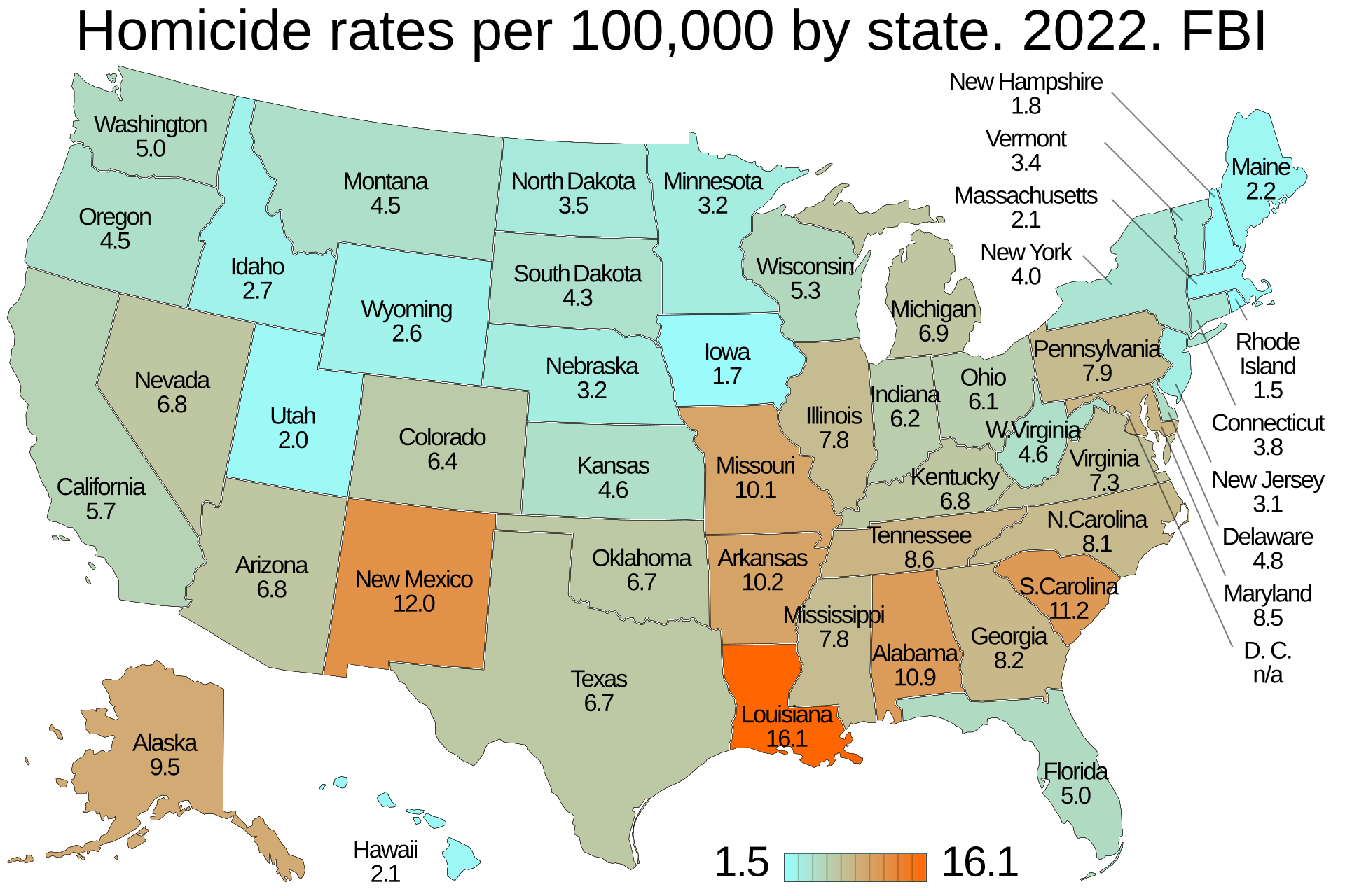
I just entered the thread. But I'm looking at something interesting. The graphic in your OP post is misleading because it uses the scary red arrows to show per capita rates higher in Republican states, but actually highlights many states with lower homicides than Democrat ones. For example, why are Montana and ND highlighted but not Oregon? Now let's pivot to a second image. The map of homicide rates per capita in Republican states is literally a map of how non-white a given population is. By census area (image in my next post) for Alaska, the area with the highest crime by far is Yukon-Koyukuk with a white population of 25%, and one of the lowest is the Southeast Fairbanks area with 82.70% white. This only fails to hold for the North Slope Burrough in the far north, the Aleutians (Caveat: 44% Asian, and asians are known to be lower crime. Combined: >42% white and asian for east, >59% for west) and Dillingham (~25% white) but all are extremely rural areas.
Montana is listed on your OP graphic, and that's 88.9% white. Fair enough. But on the county map, almost all of the homicide per capita comes from one county: Roosevelt, with a white population of 35.8%.
Most of these liberal maps of IQ, crime, and such are just racial maps. That's it. That's literally all there is to it.
Some links, you can find the rest. I'm phoneposting so it's annoying going back and forth.
https://en.m.wikipedia.org/wiki/Yukon%E2%80%93Koyukuk_Census_Area,_Alaska
https://en.m.wikipedia.org/wiki/Southeast_Fairbanks_Census_Area,_Alaska
https://en.m.wikipedia.org/wiki/Montana
https://en.m.wikipedia.org/wiki/Roosevelt_County,_Montana