
>>214576577
>Looks good tho
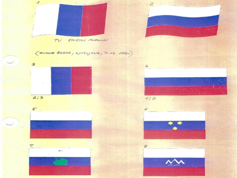
It really doesn't, the crest is ugly and way too busy, completely unnecessary. It was just something they made up on the spot. I wish we just went with the plain white-blue-red for even extra confusion, or better yet if the vertical version got picked
4chan Search
1 results for "be539c96cbc0ff0c8f364f3685cc8e28"