>>461667
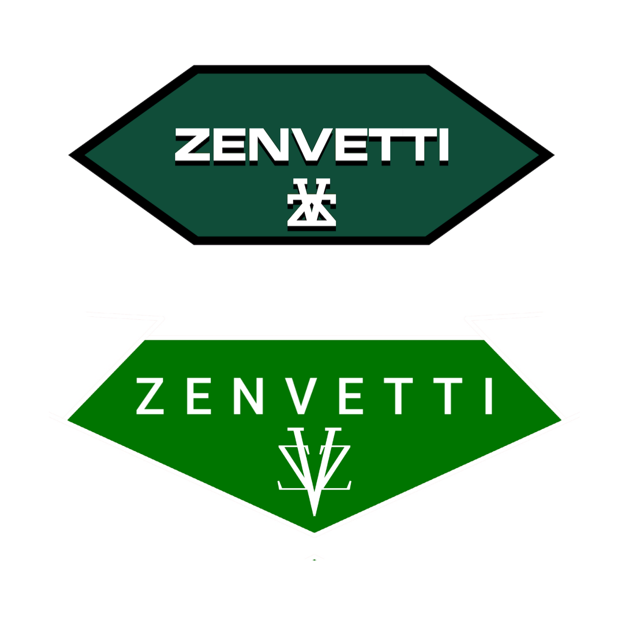
Again, not saying this is perfect- the logo part is too big but I'm on my phone and its too much ( free) work to fix- but compare the two and ask yourself which would be more likely to be seen on a classic car at the level of a Bugatti...
the squished hexagon shape doesn't really say "badge" or luxury. The logo lettering could be different but the original typeface looks like something off a college sweatshirt and the V and Z's all being flush at the bottom clunks it up.
4chan Search
1 results for "c97c8a7e88f5856928af4de498efc9fd"