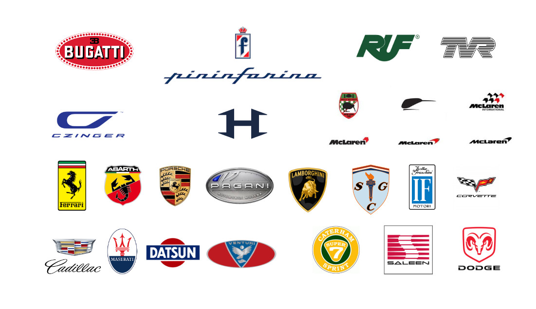
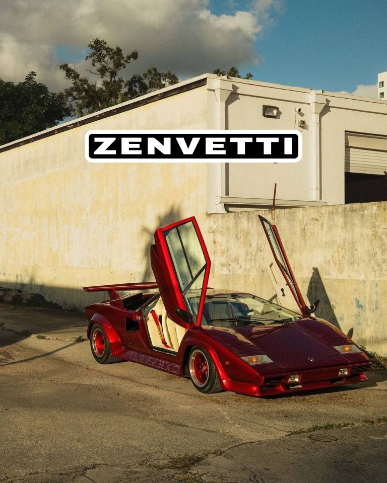
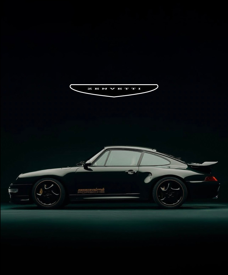
someone who is obsessed with cars
8/25/2025, 12:56:50 AM
No.461664
[Report]
>>461665
>>461667
>>461723
>>461726
>>461727
>>461812
>>461832
>>462028
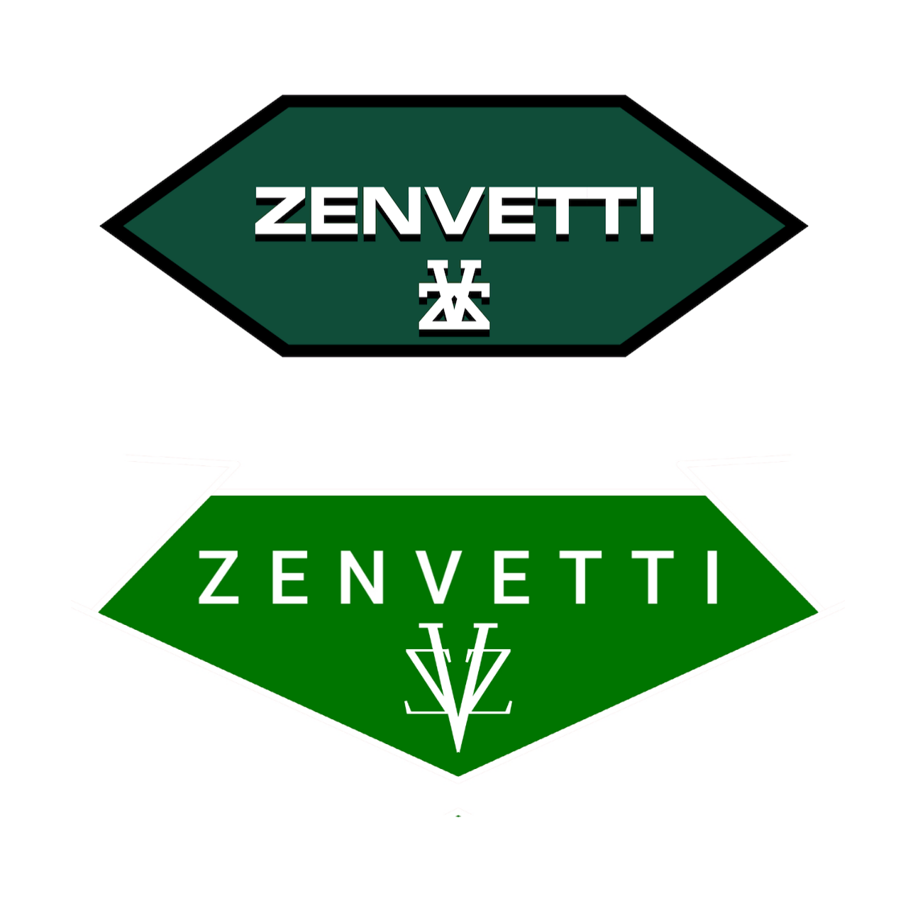
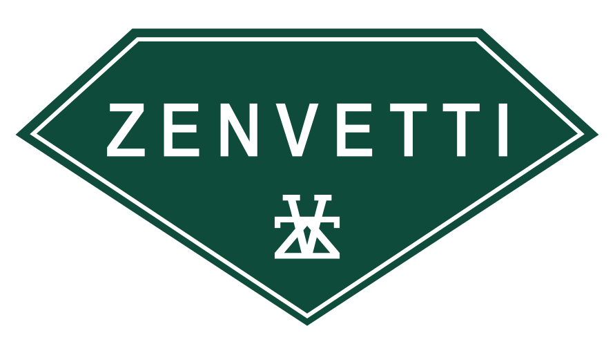
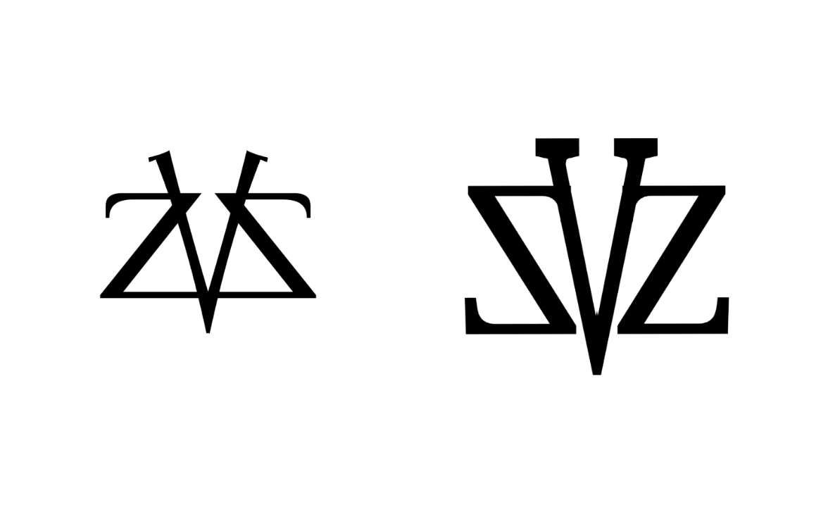
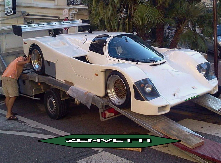
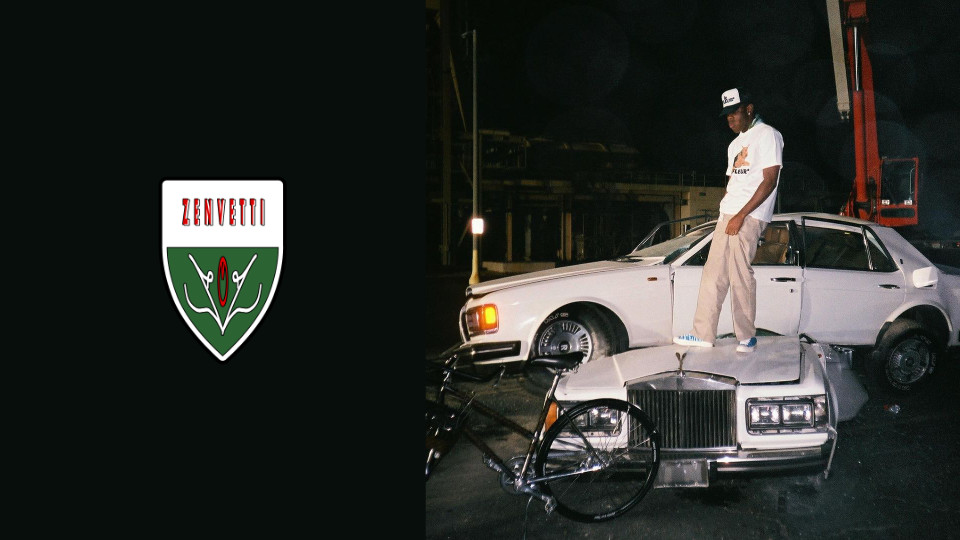
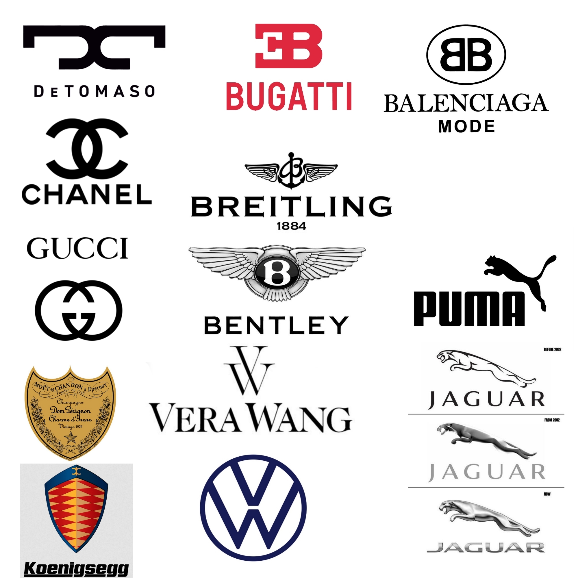
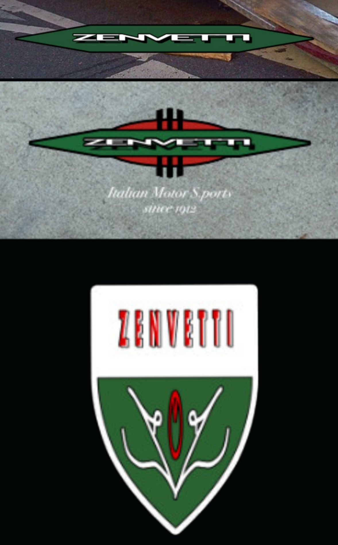
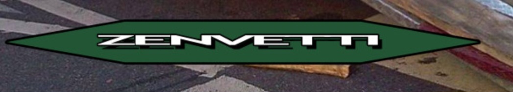
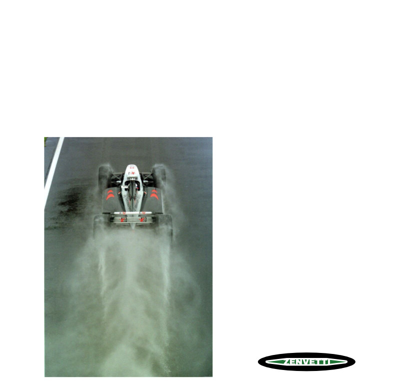
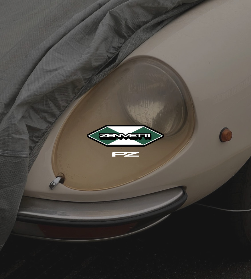
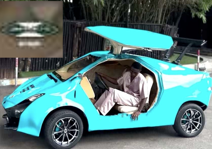
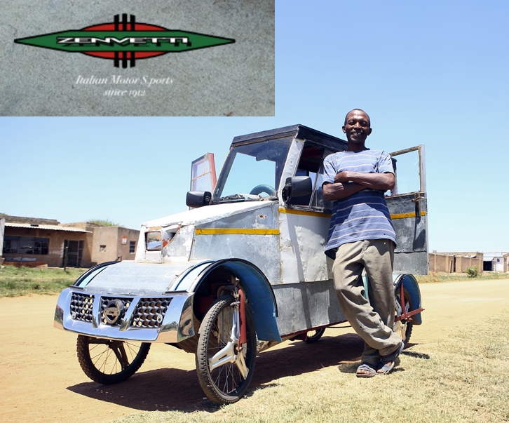
made this bugatti-inspired car brand logo

hi everyone, this is my first post in here, so i am making a fictional car brand for my game, something more like gta, and i made this logo for a bugatti-inspired car brand called "ZENVETTI", a high end luxurious supercars, please tell me everything i can do to make it better, criticize it brutally so i can improve it and actually work as a freelance and to support my project