Anonymous
7/25/2025, 5:46:05 PM
No.96176588
>>96176738
>>96176751
>>96177009
>>96177042
>>96177065
>>96177080
>>96177701
>>96177725
>>96177746
>>96177755
>>96178798
>>96178868
>>96179106
>>96180470
>>96180573
>>96181678
>>96182078
>>96182102
>>96183034
>>96183037
>>96183243
>>96183595
>>96183647
>>96184776
>>96189494
>>96191039
>>96191044
>>96191081
>>96196008
>>96201522
>>96208502
>>96208513
>>96209707
>>96209958
>>96210983
>>96211448
>>96212192
>>96212336
>>96220467
>>96226554

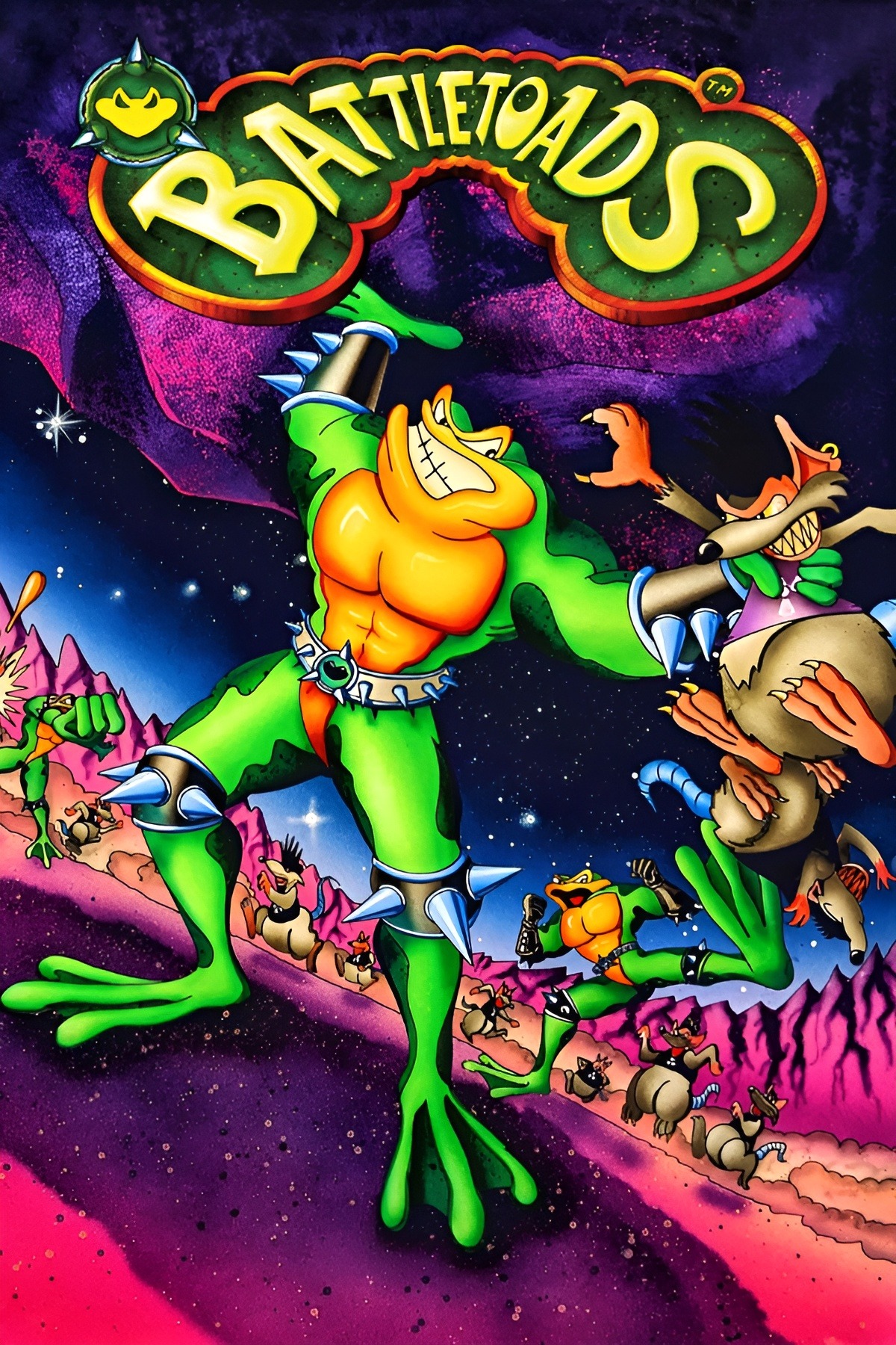
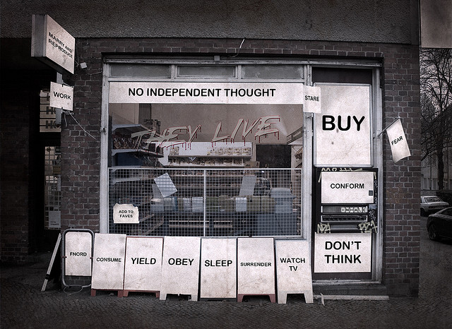
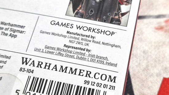
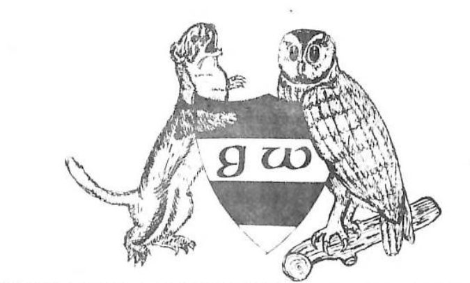
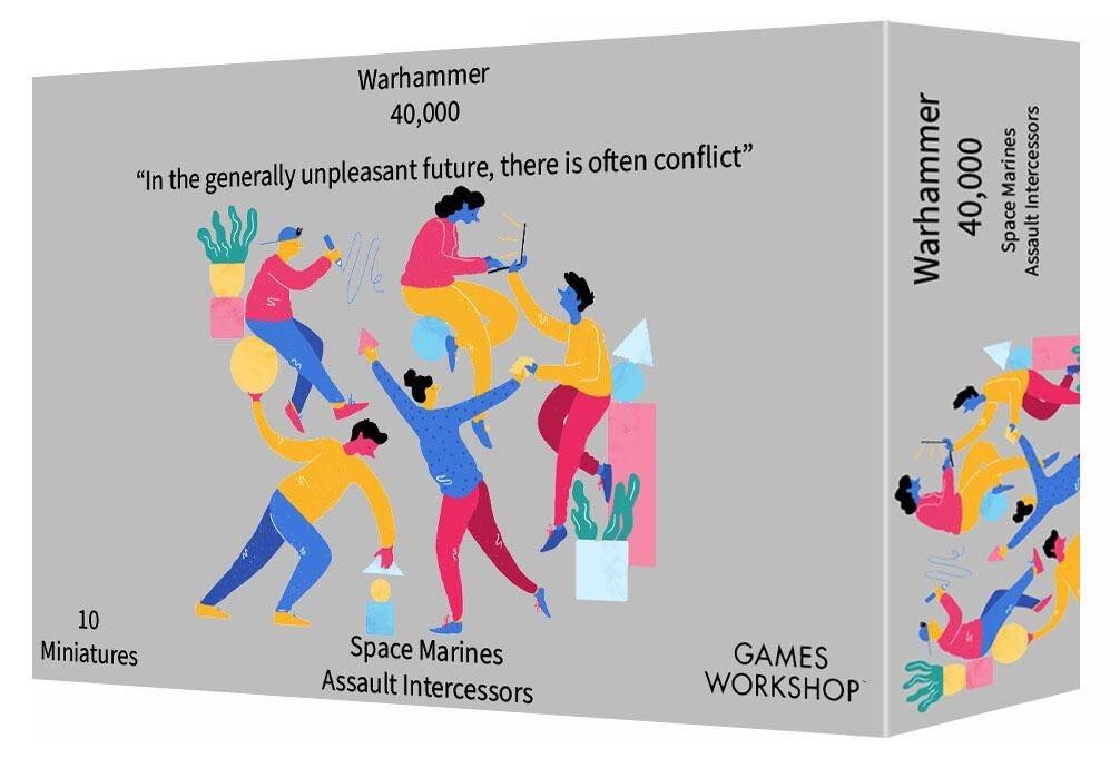
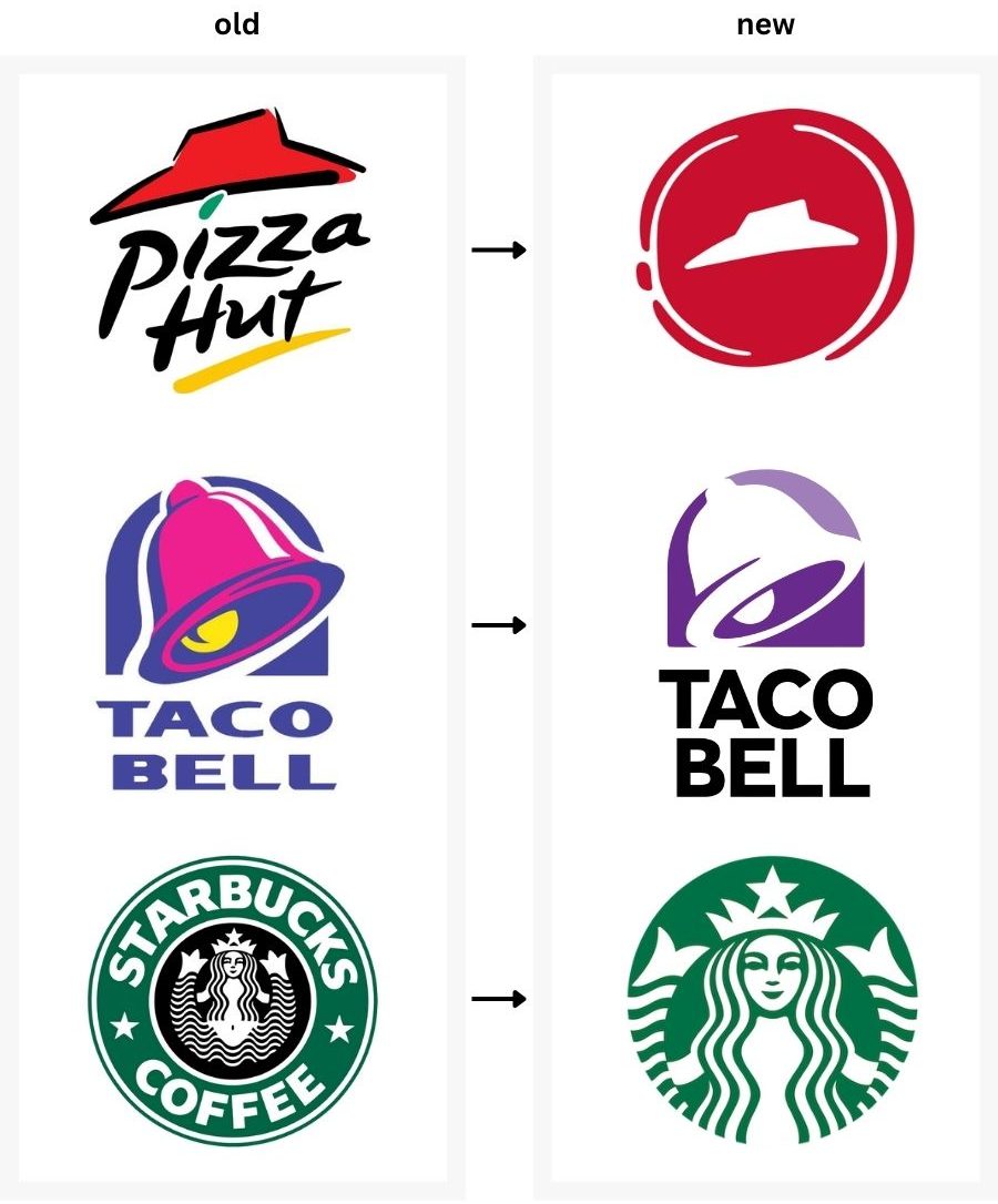
>new GW logo
>absolutely sucks
Ian Livingstone and Steve Jackson (UK) will be rolling in their graves
>absolutely sucks
Ian Livingstone and Steve Jackson (UK) will be rolling in their graves