>>713922039
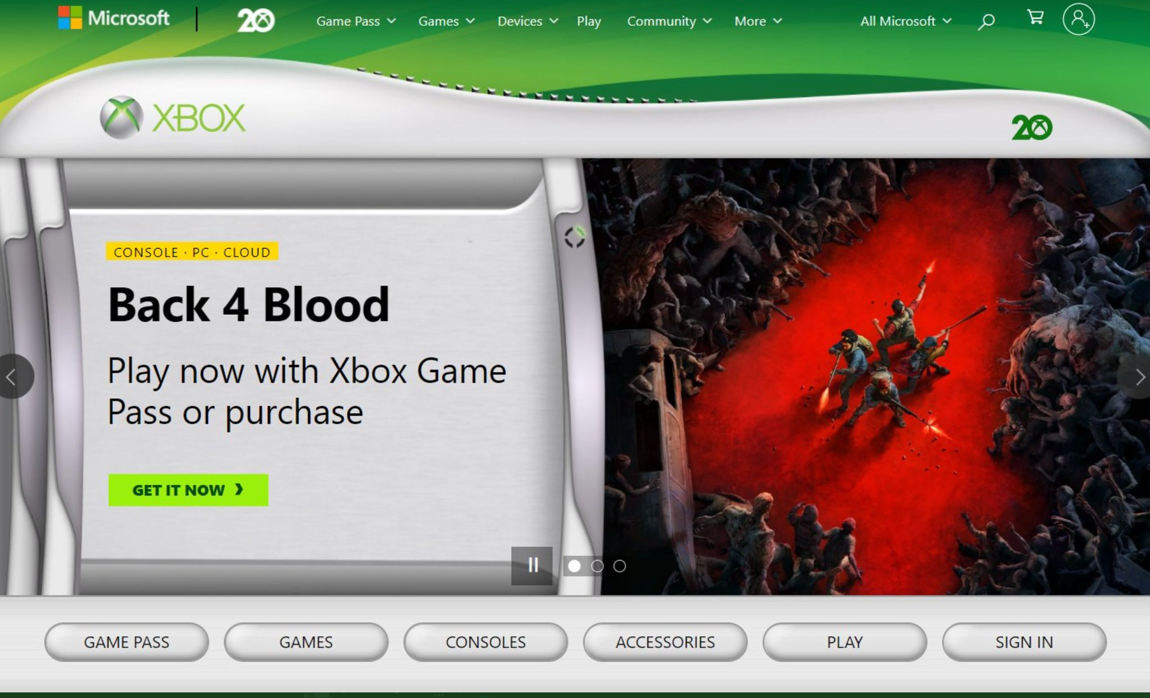
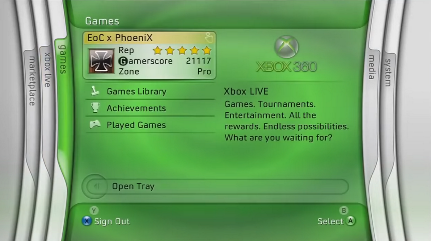
And this was the actual launch 360 UI, colorful, translucent, glossy, having parts of both.
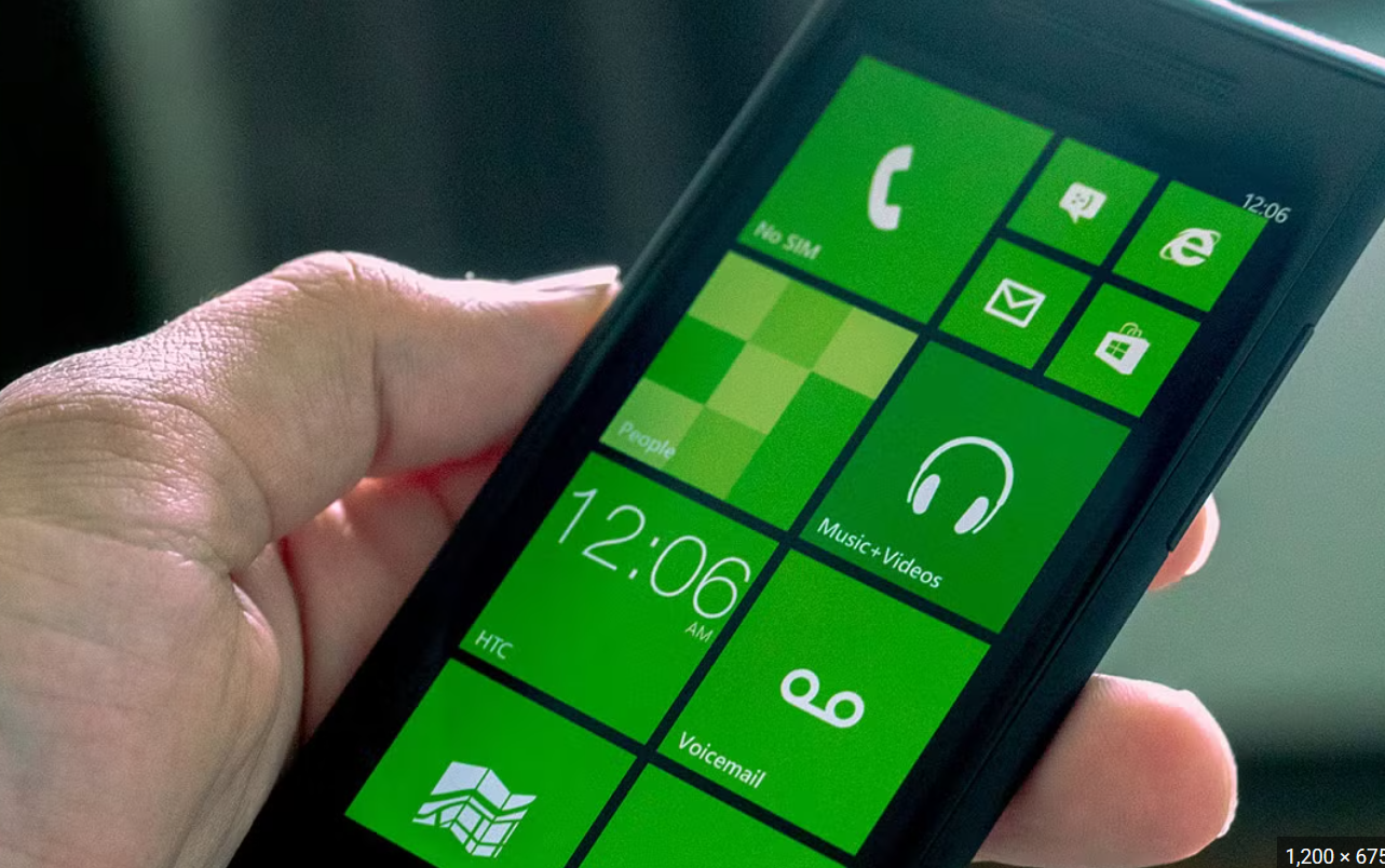
By around 2009/early 2010s this UI was changing, windows 8 came out muting the style of 7, the original frutiger aero look was gone, it was twisted and replaced by the Iphone taking over the world and everyone aiming for minimalism and muted colors.
>>713922859
There's levels to it as mentioned above, mainly between the two different eras of frutiger aero, which should be catalogued better and people still debate.
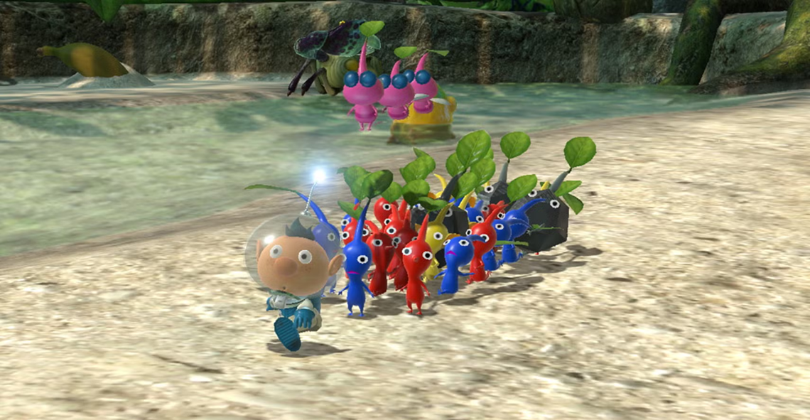
Early frutiger aero was 2003ish-2008ish, colorful, sleek, glossy, translucent, lots of white, lots of color, hopeful and futuristic but not overtly soulless, more like a futuristic funky space station sort of deal, it was a continuation of Y2K.
Early frutiger had that edge, albeit diminished, then it got fucked over.
It slowly changed over time, the colors slowly got muted and/or reduced to 1-2 with overly black and whites, the little gloss and translucency left was background UI buttons at most, and then eventually everything was fully black/white and shiny with the only color left being on the screen, like a mental hospital.