>>714435941 (OP)
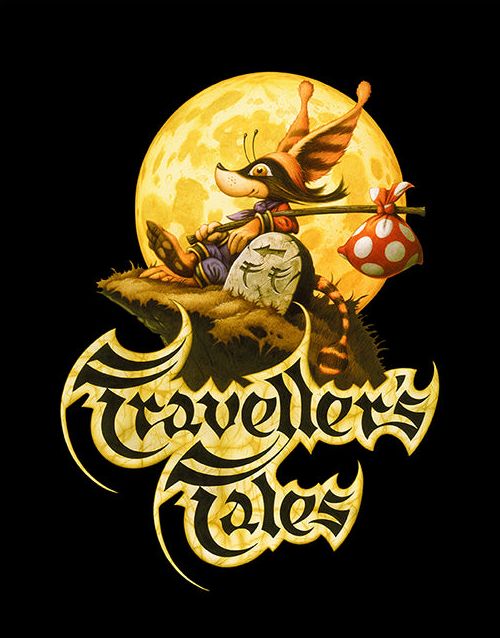
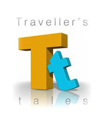
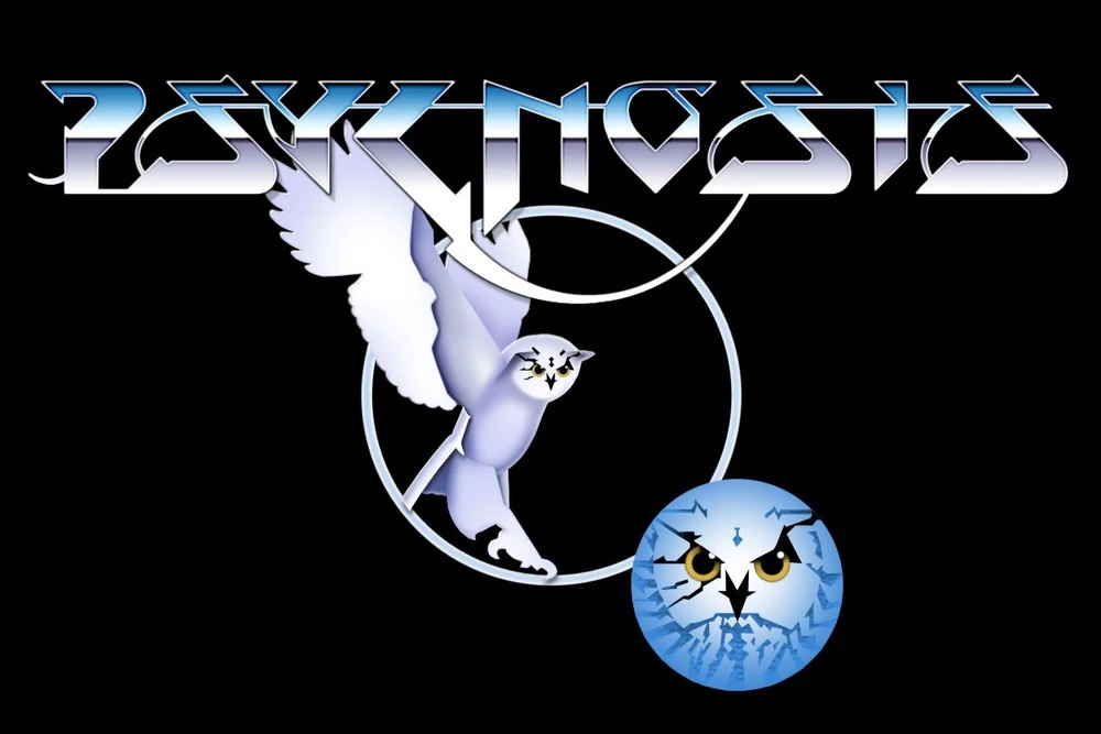
The artwork is cool, even soulful, but it isn't very practical as a logo. It looks more like video game box art than the logo for a company. >>714436159
Look at it compared to the Midday and how hard it is to read at a glance. There's too much going on. The stylized font gets squished down and becomes even harder to read.